At the Light Box in Woking, one of the few contemporary art galleries in Surrey. They had two small exhibitions about collage. The Persistence of Collage looked at how British artists had used the technique over the 20th century. Like the proverbial curate's egg, it was good and bad. Starting with Ben Nicholson and going on from there. At times, it veered between paintings that were inspired from original collages. Eduardo Paolozzi is always good value within his vivid industrial patterns.
It was a good taster for the exhibition in another part of the gallery, by Joanne Hummel Newell. Her use of collages reminded me of the early Hockney pieces with the naive use of colour and mark marking. Chance encounters that are provoking and frustrating, in some ways why art should be. This was a little gem of a show, I will be looking out for more exhibition by her in the future.
Saturday, March 3, 2012

Thursday, March 1, 2012
A Bigger Picture - David Hockney at the Royal Academy
Oh, dear.
Oh, dear. I had tried to got to this exhibition without feeling negative towards it, but is now 8 hours since wandering around and I am still very unimpressed with the results by David Hockney. There are some good bits, but mainly most of them would not be here without a 'name' to go with them.
The idea of Thixendale wood pictures at the start of the exhibition, having the same viewpoint taken from each season. Good idea, but the execution looked to naive. The early landscape before going to California was interesting. The Flight to Italy was a geographic map with a car travelling over them, with driver and passenger. I like this. Some of the Grand Canyon images and photographs were not bad and Mulholland Drive was engaging. Then I discovered it was a photographic replica and the original was still in California.
The next room of the beginning of these landscape were OK, from 1997, great shapes, bold colour, but lacking something. Perhaps it was the use of colour from his California pictures that gave them, a more expressive feel that the later pieces. I didn't like the water colours as they just felt very amateurish and the tunnel motif is some thing I had done earlier. So it was not revelatory as the exhibition notes suggested.
What did impressive me, where the charcoal drawings that were large clumps of trees in one almost solid block, but the trees were carved out. These seem to retain not only a great shape, but expressionless of the landscape. Adding colour seem to distort the viewer perception of the place, was it a landscape or just shapes of colour?
The Hawthorn series was fascinating as this was a theme that Stanley Spencer had tackled and much better than Hockney. Some of the pictures looked like things out of H P Lovecraft, perhaps I liked them for that only.
Again found that he had used the day by day motif that I am using in drawing diary of a painting a day. So you will not feel short changed by the lack of images as the galleries were packed wall to wall.
In a separate room was some film world a series of split screen that did not necessary match up to the the surrounding part of the grid. Intriguing? Yes, but great art, no. Similarly, Hockney had re-worked various images of Claude Lorraine's painting of the Sermon on the Mount, almost juvenile.
I liked the large ipad sketches, but I had my suspicions that because of their size, they dominated you as a viewer and you would think they were good. On the other hand, they were more subtle than the painting, possibly because they were more direct and immediate rather than worked upon and re-worked.
And to think I was worried that Hockney was going to appear in a similar light to Graham Sutherland (after the barrage of criticism from the recent exhibition at the Tate Britain). Even his companion Royal Academician, Barbara Rae is way ahead of him. She engages you with the landscape and her work. I am still not impressed with these Hockney landscapes, on the other hand it was packed out with viewers, so what do I know?
Oh, dear. I had tried to got to this exhibition without feeling negative towards it, but is now 8 hours since wandering around and I am still very unimpressed with the results by David Hockney. There are some good bits, but mainly most of them would not be here without a 'name' to go with them.
The idea of Thixendale wood pictures at the start of the exhibition, having the same viewpoint taken from each season. Good idea, but the execution looked to naive. The early landscape before going to California was interesting. The Flight to Italy was a geographic map with a car travelling over them, with driver and passenger. I like this. Some of the Grand Canyon images and photographs were not bad and Mulholland Drive was engaging. Then I discovered it was a photographic replica and the original was still in California.
The next room of the beginning of these landscape were OK, from 1997, great shapes, bold colour, but lacking something. Perhaps it was the use of colour from his California pictures that gave them, a more expressive feel that the later pieces. I didn't like the water colours as they just felt very amateurish and the tunnel motif is some thing I had done earlier. So it was not revelatory as the exhibition notes suggested.
What did impressive me, where the charcoal drawings that were large clumps of trees in one almost solid block, but the trees were carved out. These seem to retain not only a great shape, but expressionless of the landscape. Adding colour seem to distort the viewer perception of the place, was it a landscape or just shapes of colour?
The Hawthorn series was fascinating as this was a theme that Stanley Spencer had tackled and much better than Hockney. Some of the pictures looked like things out of H P Lovecraft, perhaps I liked them for that only.
Again found that he had used the day by day motif that I am using in drawing diary of a painting a day. So you will not feel short changed by the lack of images as the galleries were packed wall to wall.
In a separate room was some film world a series of split screen that did not necessary match up to the the surrounding part of the grid. Intriguing? Yes, but great art, no. Similarly, Hockney had re-worked various images of Claude Lorraine's painting of the Sermon on the Mount, almost juvenile.
I liked the large ipad sketches, but I had my suspicions that because of their size, they dominated you as a viewer and you would think they were good. On the other hand, they were more subtle than the painting, possibly because they were more direct and immediate rather than worked upon and re-worked.
And to think I was worried that Hockney was going to appear in a similar light to Graham Sutherland (after the barrage of criticism from the recent exhibition at the Tate Britain). Even his companion Royal Academician, Barbara Rae is way ahead of him. She engages you with the landscape and her work. I am still not impressed with these Hockney landscapes, on the other hand it was packed out with viewers, so what do I know?
Saturday, February 11, 2012
An Unfinished World
This is a stunning exhibition of Graham Sutherland early work and later work mainly from Pembrokeshire. It is nearly 12 hours since I saw and I am still highly excited. The exhibition at the Oxford Museum of Modern Art curated by George Shaw is well worth the detour that I did down the M40.
There are all manner of pieces not only finished pieces, but large sketches, small studies and some rough notes in sketchbooks. All showing his versatility of the landscapes and in looking at the work from his time as a war artist. There were some images from 1946 to 49, that show the development to his work that was later produced in Menton, the south of France.
There was so much to admire in the sheer quality of the work. I was stunned to see that there were 4 rooms filled with his work.
Unfortunately, I did not have enough time to have a more leisurely time to wander through the show as I was on the ridiculous car parking costs, but for show, I would have been happy to pay for 2 hours. Also the gallery had run out of catalogues, so I am going to have to wait to see more of these stunning images.
If you can, then it is a definite must see exhibition.
There are all manner of pieces not only finished pieces, but large sketches, small studies and some rough notes in sketchbooks. All showing his versatility of the landscapes and in looking at the work from his time as a war artist. There were some images from 1946 to 49, that show the development to his work that was later produced in Menton, the south of France.
There was so much to admire in the sheer quality of the work. I was stunned to see that there were 4 rooms filled with his work.
Unfortunately, I did not have enough time to have a more leisurely time to wander through the show as I was on the ridiculous car parking costs, but for show, I would have been happy to pay for 2 hours. Also the gallery had run out of catalogues, so I am going to have to wait to see more of these stunning images.
If you can, then it is a definite must see exhibition.
Monday, November 7, 2011
Starting Over
Today is the first day of a new sketchbook and it is always a scary thing. Even though, I have learn to avoid being too precious about a sketch book. This is always a nervous feel as the pen hits the page. I decide to start with a typical tree picture. What drew my attention was the bulky circular trunk of the tree, probably where it had been pollard.

The previous sketch book was a good 200pp A5 and so it has taken some time to get through. A change of tack is moving up to a A4 size, which is exactly the size of the scanner. This is to avoid black line through the spine. Half the number of pages probably 96pp and on slightly heavier cartridge paper rather than the smoother calendared paper that is less opaque.
Another layout, I have changed from using all the pages, to using the right hand page for the main sketch and then use the left hand page to play around with the image or quickly sketch what I felt should be the main form of the image.

The previous sketch book was a good 200pp A5 and so it has taken some time to get through. A change of tack is moving up to a A4 size, which is exactly the size of the scanner. This is to avoid black line through the spine. Half the number of pages probably 96pp and on slightly heavier cartridge paper rather than the smoother calendared paper that is less opaque.
Another layout, I have changed from using all the pages, to using the right hand page for the main sketch and then use the left hand page to play around with the image or quickly sketch what I felt should be the main form of the image.
Sunday, October 30, 2011
Stone and Wood
I was told that Malham Cove is more spectacular that Newbiggin Crags and in some ways it is, but I went to Newbiggin first , when I was at my foundation college and the place is special. The limestone pavements is split and runs like a river at times across the top of the hill. The twisted trees stand out in such a landscape and when the weather is good, made another contrast against the blue sky.


 A couple of quick sketches that I did using a brush pen, which I am still getting use too. What was also fascinating was the comparison that I had with the exhibition of Clare Woods exhibition at the Hepworth Wakefield.


Saturday, October 29, 2011
Morecambe Winter Gardens


Unfortunately, the centre of the town has been split by some large supermarkets, lying by the side of the railway line. Opposite the Midlands Hotel, a famous Art Deco building seen in many Poirot TV series. The old Marine land sea aquarium has gone as has the old lido. The town reminds me of Brighton in the early 90s, down on its luck and waiting for some thing to happen. It suffered the indignantly of being one of the top five places not to live.
Just like the theatre, Morecambe might find its way to surviving and re-inventing itself to a wider British audience.This is definitely a project that needs supporting as you can imagine how wonderful a performance would be in this theatre,even its current state. I look forward to going back and seeing it revive.
Sunday, October 2, 2011
The Singing Line

The view from Box Hill looking down toward Dorking. These are meant to be for series of big block print on a large size. I have been thinking A0 (840 x 1,188mm). So using my large brush pen and changing tack from just wanting to use only colour and no black.


One of the changes to I did was to listening to music, whilst I was at work. I usually do when in my studio, but I decided on trying it out and started with the album, Lungs by Florence and the Machine. It was the track the Drumming Song that grab my mind and led to the next series of sketches.
Monday, August 15, 2011
Out of Australia
The British Museum has a small print room, wait up on the third floor. You have to know where you are going or you would get distracted on the way up. I was there to see the Out of Australia - prints and drawings from Sydney Nolan to Rover Thomas.
Previously, the rains in London at 'flooded' out the museum with tourists and I could not get in. So I was determined to go. It proved well worth while and I wish I had gone sooner especially as there were connecting events that I had missed.
There was a wide range of work starting with the Angry Penguins through to the present including aboriginal prints. I was able to see some of Fred Williams work, whose work I knew from one or two paintings. These images were just as impressive, impressionist in their view of the landscape. The marks were stripped back to just squiggles, yet shimmering in the overall image is a landscape, muted colours might indicate where it is geographical.
As with a lot of Australian art, the styles and themes have taken time to travel. The cubism and surrealism of Albert Tucker. Yet, these artists do not slavish copy what has emerged from Europe or later the States, but used it as references to show their own Australian landscapes in this new style.
Running along side this exhibition was another called Basket and Belonging. Looking at aboriginal use of traditional skills of basket waving and how it relates to the culture of these people.
Previously, the rains in London at 'flooded' out the museum with tourists and I could not get in. So I was determined to go. It proved well worth while and I wish I had gone sooner especially as there were connecting events that I had missed.
There was a wide range of work starting with the Angry Penguins through to the present including aboriginal prints. I was able to see some of Fred Williams work, whose work I knew from one or two paintings. These images were just as impressive, impressionist in their view of the landscape. The marks were stripped back to just squiggles, yet shimmering in the overall image is a landscape, muted colours might indicate where it is geographical.
As with a lot of Australian art, the styles and themes have taken time to travel. The cubism and surrealism of Albert Tucker. Yet, these artists do not slavish copy what has emerged from Europe or later the States, but used it as references to show their own Australian landscapes in this new style.
Running along side this exhibition was another called Basket and Belonging. Looking at aboriginal use of traditional skills of basket waving and how it relates to the culture of these people.
Monday, June 6, 2011
New Cartographies
This exhibition at the Cornerhouse in Manchester has finished. Even though it dominated all three of the floors, overall the number of exhibits on show felt light.
The theme of New Cartography was the line between Algeria, France and the UK. The galleries were split into three parts - movement, place and memory. The first dealt with migration both from and to Algeria and what it meant to be a person on the seas of the 20th century histories and tides. Place looked at what Algerian landscape is whether it is desert or urban.
There were three stunning large, colour and black & white photos of the Saharan landscape. You had a stony landscape, then a caravan of camels almost lost in the bleakness of white sand and the last, a typical desert theme of sands with rocky mountains dominating these shifting sea of sands.
Memory considered the places with unusual video and interviews discussing migrating back to Algeria or looking at container ships moving across the harbour. A witty comment on how trade historically would have been across the desert sands.
This exhibition was a subtle one and appearing slight. It still gives me reasons to think a bit more about it and find out about the artists who participated in this show. They are on my fringe of vision and give me, the opportunity to look into another world, but also out back into mine.
The theme of New Cartography was the line between Algeria, France and the UK. The galleries were split into three parts - movement, place and memory. The first dealt with migration both from and to Algeria and what it meant to be a person on the seas of the 20th century histories and tides. Place looked at what Algerian landscape is whether it is desert or urban.
There were three stunning large, colour and black & white photos of the Saharan landscape. You had a stony landscape, then a caravan of camels almost lost in the bleakness of white sand and the last, a typical desert theme of sands with rocky mountains dominating these shifting sea of sands.
Memory considered the places with unusual video and interviews discussing migrating back to Algeria or looking at container ships moving across the harbour. A witty comment on how trade historically would have been across the desert sands.
This exhibition was a subtle one and appearing slight. It still gives me reasons to think a bit more about it and find out about the artists who participated in this show. They are on my fringe of vision and give me, the opportunity to look into another world, but also out back into mine.
Monday, May 30, 2011
Barbara Hepworth
Barbara Hpeworth is one of the main pillar of British Sculpture during the mid part of the 20th century. The other being Henry Moore, both were born in Yorkshire and this shows in their work. The strange rocky outcrops and crags that litter the moors are ingrained in their pieces. Both these sculptors were compared and contrasted now and then. Whereas Moore's reputation has suffered as some of the other mainstream British artists, I would suggest that Barbara Hepworth's is growing stronger.
One of the results is the new art gallery in Wakefield dedicated to her work. I visited the new building this weekend, which was only its third week of opening and has already, it seemed that there was a large flow of people coming to view both the art and the gallery. This could be seen by the way all the car parks had been closed and buses laid on for a park and ride. The building is a series of blocks linked together and not very warming. The inside is better, maybe a little too harsh minimalist, but I rather liked the shape of the rooms. One of the odd things was the windows have been blocked off, so you had to walk around these obstructions to see the views, across the river.
There were two rooms dedicated to Wakefield's own collection of historical pictures and some of the town own artwork of the same period. I gave a wry smile where there was catalogue proclaiming an exhibition by Henry Moore was packing them in. This was to set the seen of art in the 30s and 40s with some of the other sculptors work who were contemporaries. There were a couple of 'lost' artists who had were working at the same time, but never developed as 'bigger names' or nor any little gems, but people who would have influenced her and Moore with their beginnings in Yorkshire.
Another room was dedicated to the marquettes that Hepworth worked on, uusually, I had only know the small pieces that had been worked on like Moore's or even some of the small Rodin ones. However, she usually worked in a full size and it was odd seeing some of these bronzes worked out in plaster. The rougher, yest white surfaces. The large winged form was pinned to the wall and another more horizontal, rectangular pieces looking like a 3d Mondrian painting.
Besides and other room showing more polished pieces of her work there were room showing a current sculptor called Eva Rothschild with a show called Hot Touch. Her work is fascinating, both clever and witting with its use of space and usual materials. Someone whose work I will be more interested in finding out about.
All in all another gallery to show of the work of both one of the UK's major artist and some of the contemporary works as well. Definitely worth another visit.
One of the results is the new art gallery in Wakefield dedicated to her work. I visited the new building this weekend, which was only its third week of opening and has already, it seemed that there was a large flow of people coming to view both the art and the gallery. This could be seen by the way all the car parks had been closed and buses laid on for a park and ride. The building is a series of blocks linked together and not very warming. The inside is better, maybe a little too harsh minimalist, but I rather liked the shape of the rooms. One of the odd things was the windows have been blocked off, so you had to walk around these obstructions to see the views, across the river.
There were two rooms dedicated to Wakefield's own collection of historical pictures and some of the town own artwork of the same period. I gave a wry smile where there was catalogue proclaiming an exhibition by Henry Moore was packing them in. This was to set the seen of art in the 30s and 40s with some of the other sculptors work who were contemporaries. There were a couple of 'lost' artists who had were working at the same time, but never developed as 'bigger names' or nor any little gems, but people who would have influenced her and Moore with their beginnings in Yorkshire.
Another room was dedicated to the marquettes that Hepworth worked on, uusually, I had only know the small pieces that had been worked on like Moore's or even some of the small Rodin ones. However, she usually worked in a full size and it was odd seeing some of these bronzes worked out in plaster. The rougher, yest white surfaces. The large winged form was pinned to the wall and another more horizontal, rectangular pieces looking like a 3d Mondrian painting.
Besides and other room showing more polished pieces of her work there were room showing a current sculptor called Eva Rothschild with a show called Hot Touch. Her work is fascinating, both clever and witting with its use of space and usual materials. Someone whose work I will be more interested in finding out about.
All in all another gallery to show of the work of both one of the UK's major artist and some of the contemporary works as well. Definitely worth another visit.
Monday, January 3, 2011
Going to Gauguin
At last, I managed to get to the Tate Modern major Gauguin exhibition and it was absolutely stunning. The rooms were laid out in thematic order, but also tried to show the chronolgy between the pieces, how ideas recurred or were altered. This is really a must see exhibition as it has been a good few years since any previous Gauguin exhibition, I think there was a Post Impressionist exhibition around 79/80s, when I was at college; one I missed as I was 'up north'.
Starting with self portraits, this was to show that Gauguin almost created this idea of a mystical artist shaman. Yet, this has been debunked by Waldemar Januszczak's documentary about Gauguin's life. There were some fantastic paintings, Gauguin's use of perspective to add people of objects in unusual viewpoints, showing his love of Japonisme that effected the majority of French and European paintings at the time.
I was impressed that there was two rooms putting Gauguin in context with the historical events and the places that he visited. Posters of the exhibitions, that he would of visited that fed the imagination. Some sketches showing how ideas developed or how he perceived of his own work, Christ in the garden of Gethsemane.
What always impresses is finding pictures that have not been reproduced or printed as iconic images. There were several in this exhibition, and then by placing them in context with more well known images. It made you re-consider these works. You can see how the images are worked, the shapes that carry a lot of the paintings, yet the differences in painting are not that great. It is simple. You can see the use of complimentary colours to offset the ideas and how they played through.
This exhibition is going to Washington this year and if you can go, then you must. As it shows a one of the greats in context of his own times and with his own pieces.
Starting with self portraits, this was to show that Gauguin almost created this idea of a mystical artist shaman. Yet, this has been debunked by Waldemar Januszczak's documentary about Gauguin's life. There were some fantastic paintings, Gauguin's use of perspective to add people of objects in unusual viewpoints, showing his love of Japonisme that effected the majority of French and European paintings at the time.
I was impressed that there was two rooms putting Gauguin in context with the historical events and the places that he visited. Posters of the exhibitions, that he would of visited that fed the imagination. Some sketches showing how ideas developed or how he perceived of his own work, Christ in the garden of Gethsemane.
What always impresses is finding pictures that have not been reproduced or printed as iconic images. There were several in this exhibition, and then by placing them in context with more well known images. It made you re-consider these works. You can see how the images are worked, the shapes that carry a lot of the paintings, yet the differences in painting are not that great. It is simple. You can see the use of complimentary colours to offset the ideas and how they played through.
This exhibition is going to Washington this year and if you can go, then you must. As it shows a one of the greats in context of his own times and with his own pieces.
Sunday, December 5, 2010
The Art of Cornwall
http://www.bbc.co.uk/iplayer/episode/b00wbn80/The_Art_of_Cornwall/
A good BBC programme giving a clear overview of how St Ives became the centre for Modernism in the UK over three decades. Some fascinating facts came out about the struggle between artists for dominance in the Artist exhibitions. I have only recently re-discovered Peter Lanyon, although I remember going to see some of his works in a private house in Newlyn. Little realising he had wandered over the same area of the Penwith peninsula I had been whilst down there.
Lanyon flying to see the landscape as a wholly different view and being able to synthesise all the elements to create an image of a 'place' rather than a 'landscape'. A picture needs to have elements that is not only a vivid image, but one underpinned by deeper roots. The presenter used one of Lanyon's famous pieces to show how it can be looked at several ways.
One of the other good things was that when Barbara Hepworth was mentioned, there was no reference to Henry Moore. As they are usually mentioned in the same breath.
A good BBC programme giving a clear overview of how St Ives became the centre for Modernism in the UK over three decades. Some fascinating facts came out about the struggle between artists for dominance in the Artist exhibitions. I have only recently re-discovered Peter Lanyon, although I remember going to see some of his works in a private house in Newlyn. Little realising he had wandered over the same area of the Penwith peninsula I had been whilst down there.
Lanyon flying to see the landscape as a wholly different view and being able to synthesise all the elements to create an image of a 'place' rather than a 'landscape'. A picture needs to have elements that is not only a vivid image, but one underpinned by deeper roots. The presenter used one of Lanyon's famous pieces to show how it can be looked at several ways.
One of the other good things was that when Barbara Hepworth was mentioned, there was no reference to Henry Moore. As they are usually mentioned in the same breath.
Wednesday, September 29, 2010
Paul Gaugin
Paul Gauguin is one of the great artist of the 19th century and the harbinger of the 20th century. I am lucky that there is to be a large retrospective of his work at the Tate Modern this autumn and I expect to be going some time. Due to the nature of this exhibition, it has generated several programmes and critical discussion about his work and of course, his life and times.
The BBC had a superb programme by Waldemar Januszczak- Gauguin -the Full Story. Originally, broadcast in 2003, it was a 2 hour tour-de-force covering from his early life in Peru through to Gauguin's grave in the South Pacific. By going through his life with the places he lived and showing paintings of his world. You gained a sense of the context for his paintings. The shift of colour from his more northern landscapes to the Breton and then beyond to the Pacific. Januszczak is a very good presenter and gives an enthusiasm to each work as well as informing and uncovering things that had been 'lost'.
Alastair Smart's article in the Telegraph puts the case for and against Gauguin. Both as an artist and as a person. The problem is that if you view history from your own period then you are judging by the criteria in some ways shaped by that point of history. The TV programme brought out this outsider's view of Gauguin being both outside of family, friends and culture. A French man brought up in Peru and then a global traveller. The case against him looks very strong from his own family and personal relationships viewpoint. Is this a case of his artistic passion superseding his other commitments, creating a narrative of the penniless creator who struggles until he is 'discovered'. Usually, after his death, so creating a myth of the lone prophet, the voice in the wilderness and whether he then became trapped in this myth partially of his own creation?
The BBC had a superb programme by Waldemar Januszczak- Gauguin -the Full Story. Originally, broadcast in 2003, it was a 2 hour tour-de-force covering from his early life in Peru through to Gauguin's grave in the South Pacific. By going through his life with the places he lived and showing paintings of his world. You gained a sense of the context for his paintings. The shift of colour from his more northern landscapes to the Breton and then beyond to the Pacific. Januszczak is a very good presenter and gives an enthusiasm to each work as well as informing and uncovering things that had been 'lost'.
Alastair Smart's article in the Telegraph puts the case for and against Gauguin. Both as an artist and as a person. The problem is that if you view history from your own period then you are judging by the criteria in some ways shaped by that point of history. The TV programme brought out this outsider's view of Gauguin being both outside of family, friends and culture. A French man brought up in Peru and then a global traveller. The case against him looks very strong from his own family and personal relationships viewpoint. Is this a case of his artistic passion superseding his other commitments, creating a narrative of the penniless creator who struggles until he is 'discovered'. Usually, after his death, so creating a myth of the lone prophet, the voice in the wilderness and whether he then became trapped in this myth partially of his own creation?
Tuesday, September 14, 2010
St David's Head

This photograph has been taken from Whitesands Bay, just below St David's head. It has been a place I have always come to, when visiting Pembrokeshire, whether researching Sutherland or a family holiday. I have always had it in my mind that that there is a picture here and have tried composite images to create the idea and picture, which looked OK and felt OK, but......
So I was some what amazed that this time, I quickly produced three sketches of the hill. First, a traditional - more interest in the composition of the picture, then a differing colouring, secondly, more an emotional response to the land. Thirdly, a sharper image in a large sketch book as I keep on being told not to draw across two pages, but A5 sketchbooks are easy to carry. On all of the images, I decided to leave out the sky colour as the white background left the image feeling more open.


Monday, September 13, 2010
War Artists in World War Two
There was a section on the Culture Show on BBC 2 about British War Artists during World War Two, a tradition that began in the First World War and continues today. Possibly, unique in the world?
There was a section on Graham Sutherland's work during the Blitz as well as some old film footage of Pembrokeshire and its relationship to some of this landscape work. I did make me re-consider this work as it viewing it looks scratchy as if he is knows there is something there, but not sure how to organise yet. I will be watching again and looking for others, besides Henry Moore, Paul Nash - who painted the iconic Battle of Britain image, John Piper.
There was a section on Graham Sutherland's work during the Blitz as well as some old film footage of Pembrokeshire and its relationship to some of this landscape work. I did make me re-consider this work as it viewing it looks scratchy as if he is knows there is something there, but not sure how to organise yet. I will be watching again and looking for others, besides Henry Moore, Paul Nash - who painted the iconic Battle of Britain image, John Piper.
Sunday, September 12, 2010
Returning to Pembrokeshire
This summer, I went back to Pembrokeshire, staying in some places I had been too. I knew it was going to be exciting as I walked over a lot of the area in my research about Graham Sutherland and his work in the 80's. Picton Castle had created a gallery to show some of his later work there, but due to poor construction, the paintings deteriorated over time and the gallery was closed. These pieces of work were taken under the control of the National Museum of Wales and disappeared from view.
There was talk to of opening a new gallery on the A40 to make it more accessible to the general public and the possibility of opening another gallery at St Davids (the smallest city in the UK). Latterly, I discovered that this new gallery had been opened and had some of Sutherland's work on display beside other artists who had lived and worked in the area.
Having been away from this part of Wales for a decade or more, I had knew what to expect, but when you get there. It was like discovering the whole place over again. If I was on my own, I would have come back with a lot more work, but time dictated that I was busy in other areas. As has been mentioned before this part of Wales is very similar to Cornwall. This article appeared a month or two ago, and I would pick West Wales over Cornwall any day. The difference across the landscape is staggering moving from the rugged moor like landscape to the intimate coast rivers with hidden stretches of the river bank.
On a trip to Skomer Island, a small island off the coast of the Marloes area of the Pembrokeshire coast, which was a bird sanctuary as well with only the wardens living on it. I was surprised that there was wings of birds with the carcasses gone. Later found that there was a peregrine falcon that haunted the island as well preying on the rabbits as there were some skeletons lying around. The birds' wings reminded me of shorn wings by angels in stepping down to earth. Islands had a mystical quality in Celtic mythology being associated with the 'otherworld'. The placed did have a unique atmosphere to it.
Sutherland had become to incorporate both animals and people into this work and seeing this lost wings, made me wonder if these remains had started the process.
There was talk to of opening a new gallery on the A40 to make it more accessible to the general public and the possibility of opening another gallery at St Davids (the smallest city in the UK). Latterly, I discovered that this new gallery had been opened and had some of Sutherland's work on display beside other artists who had lived and worked in the area.
Having been away from this part of Wales for a decade or more, I had knew what to expect, but when you get there. It was like discovering the whole place over again. If I was on my own, I would have come back with a lot more work, but time dictated that I was busy in other areas. As has been mentioned before this part of Wales is very similar to Cornwall. This article appeared a month or two ago, and I would pick West Wales over Cornwall any day. The difference across the landscape is staggering moving from the rugged moor like landscape to the intimate coast rivers with hidden stretches of the river bank.
On a trip to Skomer Island, a small island off the coast of the Marloes area of the Pembrokeshire coast, which was a bird sanctuary as well with only the wardens living on it. I was surprised that there was wings of birds with the carcasses gone. Later found that there was a peregrine falcon that haunted the island as well preying on the rabbits as there were some skeletons lying around. The birds' wings reminded me of shorn wings by angels in stepping down to earth. Islands had a mystical quality in Celtic mythology being associated with the 'otherworld'. The placed did have a unique atmosphere to it.
Sutherland had become to incorporate both animals and people into this work and seeing this lost wings, made me wonder if these remains had started the process.
Sunday, April 25, 2010
The Lost Romantic - Paul Nash
Today, I threaded my way through the labyrinth of the South Circular to go to Dulwich Picture gallery to see the Paul Nash exhibition. Besides getting lost and I needed to go this weekend as time was against me. I had nearly given up in going, mainly because of the travel as that part of London is difficult to get too. Not proper arterial road, so it requires a lot of single roads and stop & starting.
The strange thing that kept on popping into my mind was the novel by Stella Duffy called The Room of Lost Things, set in part in South London. A part of the world that I venture across now and again, but never stay long enough to see all the places or get to know the scenery. Today, I found that there was a Dulwich Park and I wonder what is there? Is it like Greenwich park with the entrances into flat plain with a steep drop?
The Gallery is set in Dulwich Village, one of those oasis of village life in the metropolis. The area was set out in yellow aged brick, within a Georgian setting. Originally designed by Sir John Soanes - it looks odd without any windows on the buildings side. The main light comes from the roof, so giving an even 'spread' to the viewer as they look at the paintings.
Paul Nash is one of those artist who impact is more under stated. His work is has a deep power, but at times, it is delicate like a watercolour painting. Yet, here there were several paintings that I had not seen before. Some which I found intrigued me.
Pyramids of the Sea and Combat, both early work and remind me of that other great English artist, William Blake. Especially, Combat with angel and demon, and its setting on a hill near Uxbridge - some where I use to live. You got to see more of his use of surrealism, by use of opposite element. In one a port was merged into a room, you are both inside and outside at the same time.
There were do interesting pictures from his time at Dymchurch near Romney Marsh, another place on my list to go and visit. There was one of the Great Dyke, which focused on the dyke with two figures in the right corner and a fence in the left corner. This reminded me of a series of illustrations based on the Pilgrim's Progress that I had seen in Liverpool in 1980. A lot of these Romney Marsh pictures were long and flat with large areas of space. I wonder how this landscape will look when I visit, again on the list of places to go.
Need to go and check how much of this more to the wilds of Kent/Sussex helped with his interest in surrealism. The juxtaposition of images to combine and create different forms. In the room were b&w photos of his collection and how these led him on. The long furrows of a ploughing, giving texture across the whole space. His use of trees to cut out and create new creatures and the starting point, The Monster Field. It is echoed in a Sutherland picture of the early 50's. Large open spaces with objects scattered across the scene are reminiscence of sea-scapes. The strangeness of the flotsam and jetsam washed up on the shores can throw up just such opposites.
In his later paintings, I noticed that he rarely used strong outlines, something that I have done, although, I having been trying to work with just colour and rarely use black or the dark, deep brown. The shape of the paint helps to define the shape of the image. Landscape of the Vernal Equinox (III) is a good example of this style of his work.
There at the end of the exhibition was a picture that solved a problem that I have encounted in 1983 and still lies buried in my mind that there was a picture waiting to come out, but I had a good stab at the time. You have frames within frames. A pool with trees on either side, so you have a U-shape. Nash's have branches linking across the sky and then merging in with the pool below in a riot of grey, white and paler greens. It was fantastic. It has made me think that I can solve the problem of linking the areas. I can't really say why the image was flat, but I think it was that there was not enough 'tangling' elements to catch and bind the various parts of the image together. Time to dig it out again.
The strange thing that kept on popping into my mind was the novel by Stella Duffy called The Room of Lost Things, set in part in South London. A part of the world that I venture across now and again, but never stay long enough to see all the places or get to know the scenery. Today, I found that there was a Dulwich Park and I wonder what is there? Is it like Greenwich park with the entrances into flat plain with a steep drop?
The Gallery is set in Dulwich Village, one of those oasis of village life in the metropolis. The area was set out in yellow aged brick, within a Georgian setting. Originally designed by Sir John Soanes - it looks odd without any windows on the buildings side. The main light comes from the roof, so giving an even 'spread' to the viewer as they look at the paintings.
Paul Nash is one of those artist who impact is more under stated. His work is has a deep power, but at times, it is delicate like a watercolour painting. Yet, here there were several paintings that I had not seen before. Some which I found intrigued me.
Pyramids of the Sea and Combat, both early work and remind me of that other great English artist, William Blake. Especially, Combat with angel and demon, and its setting on a hill near Uxbridge - some where I use to live. You got to see more of his use of surrealism, by use of opposite element. In one a port was merged into a room, you are both inside and outside at the same time.


There were do interesting pictures from his time at Dymchurch near Romney Marsh, another place on my list to go and visit. There was one of the Great Dyke, which focused on the dyke with two figures in the right corner and a fence in the left corner. This reminded me of a series of illustrations based on the Pilgrim's Progress that I had seen in Liverpool in 1980. A lot of these Romney Marsh pictures were long and flat with large areas of space. I wonder how this landscape will look when I visit, again on the list of places to go.
Need to go and check how much of this more to the wilds of Kent/Sussex helped with his interest in surrealism. The juxtaposition of images to combine and create different forms. In the room were b&w photos of his collection and how these led him on. The long furrows of a ploughing, giving texture across the whole space. His use of trees to cut out and create new creatures and the starting point, The Monster Field. It is echoed in a Sutherland picture of the early 50's. Large open spaces with objects scattered across the scene are reminiscence of sea-scapes. The strangeness of the flotsam and jetsam washed up on the shores can throw up just such opposites.


In his later paintings, I noticed that he rarely used strong outlines, something that I have done, although, I having been trying to work with just colour and rarely use black or the dark, deep brown. The shape of the paint helps to define the shape of the image. Landscape of the Vernal Equinox (III) is a good example of this style of his work.

There at the end of the exhibition was a picture that solved a problem that I have encounted in 1983 and still lies buried in my mind that there was a picture waiting to come out, but I had a good stab at the time. You have frames within frames. A pool with trees on either side, so you have a U-shape. Nash's have branches linking across the sky and then merging in with the pool below in a riot of grey, white and paler greens. It was fantastic. It has made me think that I can solve the problem of linking the areas. I can't really say why the image was flat, but I think it was that there was not enough 'tangling' elements to catch and bind the various parts of the image together. Time to dig it out again.
Monday, April 5, 2010
Francis Bacon: In Camera at Compton Verney.
I spotted this exhibition in the listings and having been an admirer of Bacon's since my student days. I wanted to see how the photographs would relate to his work. The show was at Compton Verney - a gallery I had kept on passing on the M40 and thinking I would stop at, but one thing and another I had not. The gallery is a little off the beaten track and I prefer to stop at the place coming back to London from Up North, but the right junction you can not turn off going south. This time I was going to make the effort as I no pressing need to get back and a day spare.
Compton Verney is set in the heart of English countryside, that is Warwickshire. Getting off the junction was not too difficult and was sign posted off the motorway. The building was a small country house that had been in the hands of the Verney family for a few centuries until it was sold in the 19th century. Passing through several owners and then falling into semi-neglect. The place has been re-build and the grounds are going through a renewal process. The whole places seems perfectly formed on a small scale with two amazing bridges.
I went to the Bacon exhibition first as I was unsure about how many people might be there and how long it would take. There seemed to be more cars than people, so the whole exhibition was easy to get round without clashing with other viewers. There were a lot of reference shots from the work of Eadweard Muybridge, who produced images showing the movement of people and animals in the later part of the 19th Century. We had photos of various people in Bacon's circle and showing some of the many photos that were found in his studio. Images had been crumpled and broken up. There were one or two paintings, but the exhibition lacked depth.
Another set of rooms had an adjoining exhibition called Deconstructing Bacon and contained other works. Intriguingly, there were some cut canvas that Bacon had 'destroyed' as he became unhappy with them. These two had been exhibited and therefore photographic reproduction was available so you could see the whole image. It was similar to another Bacon with vegetation. It was strange seeing a canvas displayed with mutilation of areas cut out. Reminds me now of the Lord Leverhulme portrait by August John, which was cut up by the owner and of course, Churchill's portrait by Sutherland that was destroyed.
There was a resource center where you could manipulate your own images either in photo booth or by crumpling up magazine pages; along with some of the publications and comments by visitors.
One the other floors, where some examples of British Folk Art, which was one of the first I have seen. There were some typical native pictures but one that interested me was one depicting A Midsummer Night's Dream from the 1860s. This image looked like an Indian Mughal painting, very flat colour with a central couple and puck below at the edge of the canvas.
There were galleries for Chinese statues and objects, 17th-18th Century baroque with some of pictures of Volcanoes and some Tudor & Stuart portraits. My other find was a catalogue of Peter Greenaway exhibition Tusle Luper's 92 Suitcases, which I some how missed in 2004. I was worth a visit, but the Bacon show was disappointing, but this was due to the lack of further works to show the theme better. I look forward to an exhibition that will do the gallery justice.
Compton Verney is set in the heart of English countryside, that is Warwickshire. Getting off the junction was not too difficult and was sign posted off the motorway. The building was a small country house that had been in the hands of the Verney family for a few centuries until it was sold in the 19th century. Passing through several owners and then falling into semi-neglect. The place has been re-build and the grounds are going through a renewal process. The whole places seems perfectly formed on a small scale with two amazing bridges.
I went to the Bacon exhibition first as I was unsure about how many people might be there and how long it would take. There seemed to be more cars than people, so the whole exhibition was easy to get round without clashing with other viewers. There were a lot of reference shots from the work of Eadweard Muybridge, who produced images showing the movement of people and animals in the later part of the 19th Century. We had photos of various people in Bacon's circle and showing some of the many photos that were found in his studio. Images had been crumpled and broken up. There were one or two paintings, but the exhibition lacked depth.
Another set of rooms had an adjoining exhibition called Deconstructing Bacon and contained other works. Intriguingly, there were some cut canvas that Bacon had 'destroyed' as he became unhappy with them. These two had been exhibited and therefore photographic reproduction was available so you could see the whole image. It was similar to another Bacon with vegetation. It was strange seeing a canvas displayed with mutilation of areas cut out. Reminds me now of the Lord Leverhulme portrait by August John, which was cut up by the owner and of course, Churchill's portrait by Sutherland that was destroyed.
There was a resource center where you could manipulate your own images either in photo booth or by crumpling up magazine pages; along with some of the publications and comments by visitors.
One the other floors, where some examples of British Folk Art, which was one of the first I have seen. There were some typical native pictures but one that interested me was one depicting A Midsummer Night's Dream from the 1860s. This image looked like an Indian Mughal painting, very flat colour with a central couple and puck below at the edge of the canvas.
There were galleries for Chinese statues and objects, 17th-18th Century baroque with some of pictures of Volcanoes and some Tudor & Stuart portraits. My other find was a catalogue of Peter Greenaway exhibition Tusle Luper's 92 Suitcases, which I some how missed in 2004. I was worth a visit, but the Bacon show was disappointing, but this was due to the lack of further works to show the theme better. I look forward to an exhibition that will do the gallery justice.
Monday, March 29, 2010
Little Gems - 3
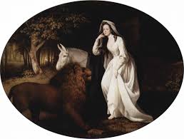
I visited the Fitzwilliam Museum in Cambridge recently and this was one of the 'little gems' that I found. It is a George Stubbs' painting - Una and the Lion Isabella Saltonstall as Una in Spensers Faerie Queene, 1782.
I have never seen a Stubbs based on a typical Georgian actor or actress portrait as you might see other painters of the period. So it was great surprise especially as I had been recently looking at Stubbs horse painting. Further thinking I can not remember many other pictures based on the Edmund Spenser's Faerie Queen. I only knew of the book because of Michael Moorcock's novel Glorianna or the Unfilled Queen. This used some familiar Moorcockian themes and a homage to one of his influences - Mervyn Peake - Gormeghast Trilogy.
Sunday, March 28, 2010
The Kiss


This is the second entry into an open exhibition on the theme of A Book About Death. The success of this first exhibition has spun off with an exhibition in Brazil and another one in Wales. It is this one that I have send my second submission.
I have decided to keep the same format off the black edged front and the white border reverse. I had been thinking that I might change the stamp on the reverse, but decided against it. One of the reasons is that the stamp might come from the same place or from the person who might or might not be death.
Again the image is from my Highgate Heads suite. The theme is of lovers in the wood and how trees can look like figures amongst the vegetation. The colour is slightly more muted and was down to a light use of washes as well as not wanting to 'overload too much' vivid colours into the image. The use of slightly lighter marking with pen to make a more delicate picture.
Subscribe to:
Posts (Atom)