Monday, April 5, 2010

Francis Bacon: In Camera at Compton Verney.

I spotted this exhibition in the listings and having been an admirer of Bacon's since my student days. I wanted to see how the photographs would relate to his work. The show was at Compton Verney - a gallery I had kept on passing on the M40 and thinking I would stop at, but one thing and another I had not. The gallery is a little off the beaten track and I prefer to stop at the place coming back to London from Up North, but the right junction you can not turn off going south. This time I was going to make the effort as I no pressing need to get back and a day spare.

Compton Verney is set in the heart of English countryside, that is Warwickshire. Getting off the junction was not too difficult and was sign posted off the motorway. The building was a small country house that had been in the hands of the Verney family for a few centuries until it was sold in the 19th century. Passing through several owners and then falling into semi-neglect. The place has been re-build and the grounds are going through a renewal process. The whole places seems perfectly formed on a small scale with two amazing bridges.

I went to the Bacon exhibition first as I was unsure about how many people might be there and how long it would take. There seemed to be more cars than people, so the whole exhibition was easy to get round without clashing with other viewers. There were a lot of reference shots from the work of Eadweard Muybridge, who produced images showing the movement of people and animals in the later part of the 19th Century. We had photos of various people in Bacon's circle and showing some of the many photos that were found in his studio. Images had been crumpled and broken up. There were one or two paintings, but the exhibition lacked depth.

Another set of rooms had an adjoining exhibition called Deconstructing Bacon and contained other works. Intriguingly, there were some cut canvas that Bacon had 'destroyed' as he became unhappy with them. These two had been exhibited and therefore photographic reproduction was available so you could see the whole image. It was similar to another Bacon with vegetation. It was strange seeing a canvas displayed with mutilation of areas cut out. Reminds me now of the Lord Leverhulme portrait by August John, which was cut up by the owner and of course, Churchill's portrait by Sutherland that was destroyed.

There was a resource center where you could manipulate your own images either in photo booth or by crumpling up magazine pages; along with some of the publications and comments by visitors.

One the other floors, where some examples of British Folk Art, which was one of the first I have seen. There were some typical native pictures but one that interested me was one depicting A Midsummer Night's Dream from the 1860s. This image looked like an Indian Mughal painting, very flat colour with a central couple and puck below at the edge of the canvas.

There were galleries for Chinese statues and objects, 17th-18th Century baroque with some of pictures of Volcanoes and some Tudor & Stuart portraits. My other find was a catalogue of Peter Greenaway exhibition Tusle Luper's 92 Suitcases, which I some how missed in 2004. I was worth a visit, but the Bacon show was disappointing, but this was due to the lack of further works to show the theme better. I look forward to an exhibition that will do the gallery justice.



Monday, March 29, 2010

Little Gems - 3


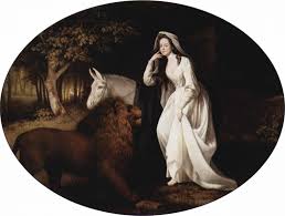
I visited the Fitzwilliam Museum in Cambridge recently and this was one of the 'little gems' that I found. It is a George Stubbs' painting - Una and the Lion Isabella Saltonstall as Una in Spensers Faerie Queene, 1782.

I have never seen a Stubbs based on a typical Georgian actor or actress portrait as you might see other painters of the period. So it was great surprise especially as I had been recently looking at Stubbs horse painting. Further thinking I can not remember many other pictures based on the Edmund Spenser's Faerie Queen. I only knew of the book because of Michael Moorcock's novel Glorianna or the Unfilled Queen. This used some familiar Moorcockian themes and a homage to one of his influences - Mervyn Peake - Gormeghast Trilogy.


Sunday, March 28, 2010

The Kiss


This is the second entry into an open exhibition on the theme of A Book About Death. The success of this first exhibition has spun off with an exhibition in Brazil and another one in Wales. It is this one that I have send my second submission.

I have decided to keep the same format off the black edged front and the white border reverse. I had been thinking that I might change the stamp on the reverse, but decided against it. One of the reasons is that the stamp might come from the same place or from the person who might or might not be death.

Again the image is from my Highgate Heads suite. The theme is of lovers in the wood and how trees can look like figures amongst the vegetation. The colour is slightly more muted and was down to a light use of washes as well as not wanting to 'overload too much' vivid colours into the image. The use of slightly lighter marking with pen to make a more delicate picture.

Saturday, March 20, 2010

Hibernation

I have been quiet on the blogging front as I have been focused on my new job for the last few months. My own output has slowed to an almost a halt, but the ideas have been ticking over or growing from one to the other and not stopping. Also practicing with new software and getting to grips in how it is used in the new part of the print industry, where I work.

I have found myself going back to my interest in comics and graphic novels. Starting to work on some drawings for some of my gaming friends and developing cover ideas. One of the big projects, is to work on a graphic novel or more likely novella. More a case of doing it rather than creating a great bit of literature or drawing. Again it has paused, so my writing about it inception, I am hoping to begin to up the current pace.

After my 'lost year' I have trying to control costs, so have not been out much or into London to see many new exhibitions. I am looking for to go and see the Paul Nash at the Dulwich Picture Gallery. Nash is one those Neo-Romantic painters of the mid-century British artists, who has had to be defined by this grouping. I would say that this grouping is a short hand for critical studies. These painters - Paul Nash, John Nash, Graham Sutherland, Vaughan, Armitage, Ayrton are not a cohesive grouping as others or whether they would claim such an idea.

Another exhibition I am looking forward to seeing is Henry Moore at the Tate Britain. Like Graham Sutherland, Moore's reputation has suffered since his death. It has been fashionable to consider Barbara Hepworth more important than Moore, but in my Art College days Moore was like a giant on the landscape. One of the reasons, I feel I can relate to his work is the relationship to the northern landscape. Rocky crags staggered onto the horizon line, not complete ranges or outcrops dug into the hillside half finished or abandoned villages from the industrial age.

This year, I hope to get to some museums and galleries that I have not seen. So watch this space!

Friday, January 1, 2010

Tadahiro Uesugi

Finally, I got round to watching the film, Coraline having read both the book and the graphic novel - Craig P. Russell's illustrations are gorgeous.Yet, tucked away in the special features the animators talked about the work of Tadahiro Uesugi. Some one I have never heard of, but the illustrations just knocked me sideways.

It reminds me of my early discovery of Paul Hogarth's illustrations with pen and ink. Uesugi combines both this 'scratch-like' pen manship, but harks by to a 50s style. I can see how it might have been used for the silk screen with the stuck fantastic colour. The colour is subtle, but it also pulls your eye to it. Sometimes you think the clash of colour, but it works.

I hesitate to be cliched to say how different the perspective to a western eye and reminds me of the prints of the 'Floating World'. The use of white space within the image is fantastic.

Sunday, November 29, 2009

Note From An Exhibition

Today I went to the Anish Kapoor at the Royal Academy of Arts in Piccadilly.

The exhibition was a riotous explosion of noise and exuberance with the entrance filled with a wide metal riveted construction that filled the whole room. As you entered the exhibition, you were faced with this sculpture. You were pinned up against the door, looking into the empty hollow, that was black, but as you looked, light penetrated into the depths of the piece. It was very, a very female piece as you were looking between the legs into the depths of her womb.

As you walked to the sides, you found that the metal was shaped like a sycamore seed. It was a burnt orange, riveted with bands of darkening brown. Almost protective, the shape of the room, an octagon also helped that it forced you to go round in one or two ways. Like me some people bent themselves up and slip under the arch of the sycamore to escape into other rooms.

In the next room, there were several pieces of highly polished mirrors . These were almost typical fairground as you looked at the sculptures, you could see the distorted images as you wandered through the gallery. Yet, with all the works around the room, it created multiple images that reflected off one another.

The next room was one large yellow wall, but in the centre was a hollowed out sphere in yellow. Then the room was empty, so the yellow wall had false space, that you could look at both an embossed or debossed image. The size was massive and it dominated the whole room, even as you sat opposite the hole in the wall.

There were some smaller pieces on floor and high up on the ceiling. I remember seeing these pieces before at the Liverpool Tate, where my mother had offered a view that the colours were religious in one context. To my current eyes, they looked playful and reminded me of some surrealist works or Miro in a 3-D shape.

The room everyone had come to see was the cannon that fired cylinders of red wax into a room. This was the small gallery in the corner, by now the room had filled and the red wax looked like a river opening out of the room. Although, I had thought it, an unusual idea and just something for show. It was a more engaging work, when viewed. The excitement of the viewers as the canon was about to be fired, the reaction as the wax landed and added to the whole cascade out the room.

Kapoor had taken over three rooms with a moving slide of red wax that fitted the door way. This moved ever so slowly through the halls on a sliding mechanism. It was strange to see this slab moving along a track that you could not cross. Long lines of movement were laid out in the wax. Another gigantic piece that dominated, you could only view it from certain entrances or rooms. You also had to be told not to put it on your hands as it could damaged clothes.

Another room had a similar pieces to the main entrance, but this time the ovaloid entrance looked like lips or a flower and from it flowed a meandering line. This wiggled through the room, but you could only walk around it, not through it or climb over it. It felt like a ‘line going for a walk’.

The last room had a series of clay roundels scattered in the gallery. There were on pallet tops and filled the area. You had to pick your way through these manquettes as they were grey and unfinished, in as much they had not been fired. So they still look malleable and waiting to be finished. What this a reply to the Anthony Gormley piece, The Field?

Besides the riotous noise and the joyous laughter of the people with their children that tended to dominate the exhibition. The whole exhibition was an exercise in space; how and when to use it and it was very successful. The large pieces tended to demand respect, but the moving wax was a good idea and seems to work. However, I am not sure that these pieces will be effective over years or have greater depth.

The yellow wall was stunning and you could fall into it, but the moving wax was an event and maybe you have to be there for the anticipation as the wax moves and where it falls. Overall the exhibition was fun and I thought use of space superb. Making me think about space for sculpture and its absence can define work.


Saturday, November 7, 2009

Walkabout


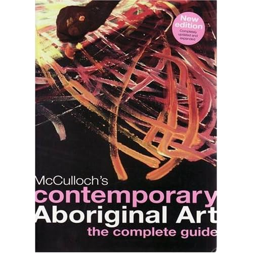
I got a copy of this book in the last few days as I had a Library copy out for the last few months. This Library edition was fantastic, but this new updated book is stunning. The paper back book has flaps and printed end papers with a map showing the main regions of the artists.

At some point, I will be re-reading it again as even with just flicking through it. There is a lot more stunning paintings and it has been re-designed so you can identify the artists with the regions using the map at the front.

This book is a great introduction to Aboriginal Art and beg, borrow or steal a copy as it a brilliant book. One for the permanent collection.