Thursday, April 9, 2009

Book of Days - Icarus


The book looks battered and torn. It reminds me of a dead pigeon that had been attacked by a either a cat or the sparrowhawk. The feathers and part of a wing were scattered across the garden. How much will be left by the end of year. I can see the plants greening the area over and the skeletons remains become lost.

At present, I have fallen into a fallow period and not touched a pencil to a large pieced of paper. In a way, I see this book as a metaphor of myself, something that is lost, but also a seed waiting to spring forth. Perhaps I need some rest and bit more time to just wander and draw.

Little Gems - 2

Traveling up to Norwich for an interview was not what I expected to be doing in late March, but circumstances dictated that I had to go. As I woke up early and found it difficult to get back to sleep. I realised that I would get cheap rate on the QE2 bridge for this time in the morning, so I was on the road at 5.30am. The toll was free and the radio played all the way through the tunnel. No hold ups, so it was turn right at the M11 and then straight on till morning.

It was a little strange seeing the dawn break across the flat lands of the East Anglia. I have never been a great fan of Constable or Gainsborough who lived and worked in this part of the England. I wrote previous of Peter Greenaway's film, Drowning by Numbers and how it used the painterly qualities to emphasise the film's visual look. There was something eerie as you cross the long stretch from the Duxford junction across there flat country. As you go through Breckland Forest, it is only by having heard a radio programme about the work in the 1930's that you realise this is a transplanted forest and to give people work. The name, King's Warren is also significant as it points to a time, when rabbits were a prized animal as it was imported into the country in Medieval times. Now they watch by the wayside as the cars rush by.

After the afternoon interview, I discovered that Sainsbury Visual Arts Centre in the University of East Anglia have a late evening opening on Wednesday. So I was able to go unhampered with having to drag truculent children round. It proved a little tricky to find wandering through the student campus. It had an ubiquitous Henry Moore outside.


The centre was also unusual in that it had lots of space up to the roof; giving it an airport feel. It reminded me of the engine gallery in the Tate Modern, but where that was cold harsh and industrial. This space was cool and warm, being placed on the outside of the campus with the countryside on three sides and on a slight hill, so you got a good view across the tree tops. The sun was starting to faded and the sky was that bleached blue that was drifting into night.


The gallery had various layers with the permanent collection to one side, the reserve collection below and the temporary exhibition is to the side and below as well. The collection is based around the collectors, Robert and Lisa Sainsbury who collected modern art from the 1930s through to the 1960s as well as ethnic items from across the global. There was some interesting pieces of ceramics.

The pieces of sculpture and ceramics were in display cases and as they were given a lot of space, whereas in the past, a lot of ethnic displays crammed so much together in a jumble. This creates something different with being placed in a case, the image below shows some small pieces, offering statues for devotees. Each piece might be from a different date and a area, but here they are related inside a box. You as the viewer can not help but link pieces together in some form.


The juxtaposition of some pieces create some interesting elements. I could not resist the Henry Moore's drawing and the mask that were placed in close proximity. The Moore drawing was interesting as it had some unusual techniques and looks like the Leonardo in the National Gallery as looking at it again as I type, a red Greek vase with the strong reddy orange background.


I found myself wandering around the exhibits and did not have time for the temporary exhibition called China China China. The piece that did dominate was a large globe made up of lights that lit the surrounding area and could be seen from the main entrance and rest of the collection. One of the strongest images I have of the place with this round circle in a rectangle.
Definitely worth another visit and look forward to going again.

Monday, March 23, 2009

Kuniyoshi at the RAA

This was a stunning exhibition that had been set up in the Sackler Gallery on the top floor of the Royal Academy of Arts in Piccadilly. The exhibition was just jam packed, usually, this gallery has the smaller show, but each room was crammed with Japanese prints. It was so big, that I wanted to stop half way and come back again.

I great admire Japanese prints from my earliest days as 16 years old at Art College. There were a really good series on Japanese print artists and I still have my copies of Hiroshige and Hokusai bookcase downstairs. Hokusai has been mentioned as the precursor of the comic form of Manga, again you could rarely find examples here in the west until the American reprints of Lone Wolf and Cub came out. Usually, you had to wait and set Kurosawa's Samurai films to get a similar feelings. Then we had the the Manga explosion here in the UK and it seems quite settled. However, I have rarely found Manga as good as Lone Wolf, the only one that comes close, IMO, is Doll with stories just as good.

Kuniyoshi lived and worked during this period of Ukiyo-e across the 18th/19th century. His main oeuvre was warrior prints, these are usually dynamic portraits of heroes or in some cased diptychs or triptychs. This was because the cherry trees wooden printing blocks would be 36 x 25cm in size, due to the tree trunks size. These blocks would be printed in usually five colours and using a black keyline block to pull the colour elements together with any wording that was required.

These warriors are laid out with strong, structure, but then have the most gorgeous clothes with elaborate designs, that seem so far beyond any of the colour or black & white prints of the western world. Kuniyoshi was able to extend this single prints and combine them to achieve a larger image that can be seen overall or on their own.

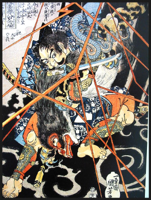
What struck me in going round this exhibition was the colour. It is the structure and the composition that draws my eye first. Yet in this exhibition it was the delicate colours that were printed. The way they used vignette or graduated tone as a background, as I spent a lot of time trying to replicate on my own printmaking course. Some of the colours are very subtle and not primary colours or using strong bold colours to create statements. This is particularly shown with the image Yorimasa Killing the Nue with the lightning in a strong, bold colour and the black background emphasise this.

The other great thing was so see a couple of preliminary drawing sketches that I can not recall in seeing any of these sketches before. They were fascinating in how they were used on the wooden blocks and how Kuniyoshi was working his ideas, the rough use of a brush rather than a pencil or charcoal. I will be going again to see this wonderful exhibition again.

Friday, March 20, 2009

Early Days

It has been some time since I shown some images of the Book of Days, that has been laying out in my garden over the last few months. The book has changed dramatically over the period of the last fes weeks, from the frosty part of February and the snow (once in 20 years in this part of the world).


Buried in a white winding sheet across the ground.


Now buried with fallen leaves as there had been a lot of rain, the book has been bent by the water.


Now, it looks as if some animal has attached the book after all this time in the garden. Now more pages are exposed and can the book survive the year? Should I get another one ready to replace it? I do like the way the pages have opened or is it another flower rather than a carcase?

Thursday, March 19, 2009

Watching the Watchmen

I saw the film on Tuesday and still trying to make a decision. The best so far was that visually is that it is superb, but...There is something wrong. Yes, the tweak at the end is OK. The Martian scenes were great and yet.

Two things stood out today as one of my friends said, 'Why do a film, when the graphic novel is so good - Does it add anything to the story'. Answer is no. I remembered that there was a re-make of Hitchcock's Psycho frame by frame and this is what I think happened to the film. It was shot almost like for like, but why? It is a different medium and therefore, it must add some that it unique to the story that either text in a novel or in this case, comic art could not do.

One of the innovations that the graphic novel showed to great effect was the use of colour in the storytelling. Yet I can not remember anything in this film that suggested that. Peter Greenaway's film, The Cook, The Thief, His Wife and Her Lover, the colour did show the difference from the various places in the film.

I thought the cinema cost was not worth the wait and the DVD might have more on it from the various articles I have read. So you might be worth waiting for the DVD.

Tuesday, March 17, 2009

Tertal - Bare Bones Part 3

This is the last stage of the first piece. In a way, it looks like a typical piece of my work and this is perhaps what disappoints me the most. The leaf of the book has been lost in the overall tangle of the trees' branches. Yet, you can not see the textural qualities of the as I drew and drew on the picture, the paper broke down. I had to glue a second piece of paper to the back of the first to give it some support.

This allowed me to continue working on the picture. Again the medium ground of the red soil has been taken back by working on the areas. Firstly in pencil, then with water to merge the soluble pencils into a 'solid' background. Again using an eraser to cut into this area, using the water to scourge back the colour and give it the harsh feeling of soil cut open.

As I look on it, I feel it should go on, but then not. I think, I would prefer to put it away and start again. Sky looks OK, but not brilliant, could do with some further work here, but what of the lost leaf, that I was trying to emphasise in this series.

Tuesday, March 10, 2009

Little Gems

I love going to the art galleries in the towns as you never know what you will find. Normally, there are a lot of Victorian paintings, sub PRB, but then tucked away. Some thing sparks your interest. When I visited Brighton recently, the gallery there had an exhibition called Paintings Unwrapped, which was a compare and contrast of paintings from the collection. It used paintings that could be described as minor pieces and used then to co-ordinate the audience's eye to uncover new ideas. Points that might be lost.

This was a wonderful way to use these paintings that are likely to be hidden in the vaults somewhere waiting to come out for display. Some times the pictures were war time realsim compared to classical Victorian melodrama. Yet just going into their is some thing waiting to be discovered, it might not necessarily spark interest in you, but it might be some one else who is inspireed.