This was a stunning exhibition that had been set up in the Sackler Gallery on the top floor of the Royal Academy of Arts in Piccadilly. The exhibition was just jam packed, usually, this gallery has the smaller show, but each room was crammed with Japanese prints. It was so big, that I wanted to stop half way and come back again.
I great admire Japanese prints from my earliest days as 16 years old at Art College. There were a really good series on Japanese print artists and I still have my copies of Hiroshige and Hokusai bookcase downstairs. Hokusai has been mentioned as the precursor of the comic form of Manga, again you could rarely find examples here in the west until the American reprints of Lone Wolf and Cub came out. Usually, you had to wait and set Kurosawa's Samurai films to get a similar feelings. Then we had the the Manga explosion here in the UK and it seems quite settled. However, I have rarely found Manga as good as Lone Wolf, the only one that comes close, IMO, is Doll with stories just as good.
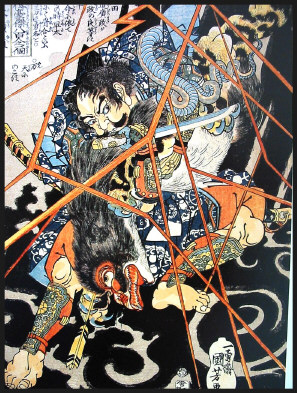
Kuniyoshi lived and worked during this period of Ukiyo-e across the 18th/19th century. His main oeuvre was warrior prints, these are usually dynamic portraits of heroes or in some cased diptychs or triptychs. This was because the cherry trees wooden printing blocks would be 36 x 25cm in size, due to the tree trunks size. These blocks would be printed in usually five colours and using a black keyline block to pull the colour elements together with any wording that was required.
These warriors are laid out with strong, structure, but then have the most gorgeous clothes with elaborate designs, that seem so far beyond any of the colour or black & white prints of the western world. Kuniyoshi was able to extend this single prints and combine them to achieve a larger image that can be seen overall or on their own.
What struck me in going round this exhibition was the colour. It is the structure and the composition that draws my eye first. Yet in this exhibition it was the delicate colours that were printed. The way they used vignette or graduated tone as a background, as I spent a lot of time trying to replicate on my own printmaking course. Some of the colours are very subtle and not primary colours or using strong bold colours to create statements. This is particularly shown with the image Yorimasa Killing the Nue with the lightning in a strong, bold colour and the black background emphasise this.
The other great thing was so see a couple of preliminary drawing sketches that I can not recall in seeing any of these sketches before. They were fascinating in how they were used on the wooden blocks and how Kuniyoshi was working his ideas, the rough use of a brush rather than a pencil or charcoal. I will be going again to see this wonderful exhibition again.
Subscribe to:
Post Comments (Atom)
No comments:
Post a Comment