Sunday, November 29, 2009

Note From An Exhibition

Today I went to the Anish Kapoor at the Royal Academy of Arts in Piccadilly.

The exhibition was a riotous explosion of noise and exuberance with the entrance filled with a wide metal riveted construction that filled the whole room. As you entered the exhibition, you were faced with this sculpture. You were pinned up against the door, looking into the empty hollow, that was black, but as you looked, light penetrated into the depths of the piece. It was very, a very female piece as you were looking between the legs into the depths of her womb.

As you walked to the sides, you found that the metal was shaped like a sycamore seed. It was a burnt orange, riveted with bands of darkening brown. Almost protective, the shape of the room, an octagon also helped that it forced you to go round in one or two ways. Like me some people bent themselves up and slip under the arch of the sycamore to escape into other rooms.

In the next room, there were several pieces of highly polished mirrors . These were almost typical fairground as you looked at the sculptures, you could see the distorted images as you wandered through the gallery. Yet, with all the works around the room, it created multiple images that reflected off one another.

The next room was one large yellow wall, but in the centre was a hollowed out sphere in yellow. Then the room was empty, so the yellow wall had false space, that you could look at both an embossed or debossed image. The size was massive and it dominated the whole room, even as you sat opposite the hole in the wall.

There were some smaller pieces on floor and high up on the ceiling. I remember seeing these pieces before at the Liverpool Tate, where my mother had offered a view that the colours were religious in one context. To my current eyes, they looked playful and reminded me of some surrealist works or Miro in a 3-D shape.

The room everyone had come to see was the cannon that fired cylinders of red wax into a room. This was the small gallery in the corner, by now the room had filled and the red wax looked like a river opening out of the room. Although, I had thought it, an unusual idea and just something for show. It was a more engaging work, when viewed. The excitement of the viewers as the canon was about to be fired, the reaction as the wax landed and added to the whole cascade out the room.

Kapoor had taken over three rooms with a moving slide of red wax that fitted the door way. This moved ever so slowly through the halls on a sliding mechanism. It was strange to see this slab moving along a track that you could not cross. Long lines of movement were laid out in the wax. Another gigantic piece that dominated, you could only view it from certain entrances or rooms. You also had to be told not to put it on your hands as it could damaged clothes.

Another room had a similar pieces to the main entrance, but this time the ovaloid entrance looked like lips or a flower and from it flowed a meandering line. This wiggled through the room, but you could only walk around it, not through it or climb over it. It felt like a ‘line going for a walk’.

The last room had a series of clay roundels scattered in the gallery. There were on pallet tops and filled the area. You had to pick your way through these manquettes as they were grey and unfinished, in as much they had not been fired. So they still look malleable and waiting to be finished. What this a reply to the Anthony Gormley piece, The Field?

Besides the riotous noise and the joyous laughter of the people with their children that tended to dominate the exhibition. The whole exhibition was an exercise in space; how and when to use it and it was very successful. The large pieces tended to demand respect, but the moving wax was a good idea and seems to work. However, I am not sure that these pieces will be effective over years or have greater depth.

The yellow wall was stunning and you could fall into it, but the moving wax was an event and maybe you have to be there for the anticipation as the wax moves and where it falls. Overall the exhibition was fun and I thought use of space superb. Making me think about space for sculpture and its absence can define work.


Saturday, November 7, 2009

Walkabout


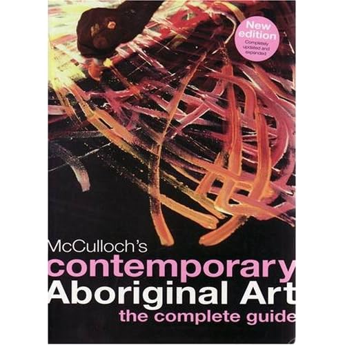
I got a copy of this book in the last few days as I had a Library copy out for the last few months. This Library edition was fantastic, but this new updated book is stunning. The paper back book has flaps and printed end papers with a map showing the main regions of the artists.

At some point, I will be re-reading it again as even with just flicking through it. There is a lot more stunning paintings and it has been re-designed so you can identify the artists with the regions using the map at the front.

This book is a great introduction to Aboriginal Art and beg, borrow or steal a copy as it a brilliant book. One for the permanent collection.

Monday, October 19, 2009

Digging in the Dirt

Yesterday, I got out my old degree portfolio as I had been worried that it had been damaged by a little flood damage in the garage as I had run out of space to keep these previous drawings and prints safely. Inside the portfolio was five sketch books that go back into my early days, the sketch book for Deep Root Down. When I went to Exmoor in my second year at art college. Little did I know that this visit would provide me with the materials for my litho prints in the third year.

These litho print gave me the confidence to use use print making and still I would have liked to have a few more years, if I had made it to postgrad to work further. Also one of my prints got me to win a competition and have the print exhibited at the Royal Academy of Arts for the Stowells sponsored show. Little did I know that my involvement would take me.

Digging out these sketch books was in some ways walking over my grave as it was work that had been done some time ago, a long time ago and I could see the faults in it. Yet, within those sketches, I knew there was something that I could take away from it. One of my tutors told me that sometimes you don't need to go from A to B to C, but you can leap ahead and this is how I look at these sketches. I have leaped ahead both mentally as well as artistically. There is the thread that links all of this work up from the future to the present and back to the past.

Seeing all the pictures that I had worked on and there were other sketch books that I had thrown away as there is only so many you can keep over the years. Looking at these pieces, I begin to wonder if I have kept the right ones? Some of these sketches did become proper prints and have survived. The portfolio was not damaged and so I can let it go. Yet deep in side it is still a part of me.

Friday, October 16, 2009

Back to Unkown Seas

I have finished my 'old' sketch book. It has only taken some 3 years to do. Originally began when on holiday in Dorset, next another holiday in Brittany and then continuously, when I was at work, I would try and go out at lunch for a break to find something to draw. Usually, I would be looking for a landscape or a certain tree or shapes to draw.

Each sketch would aim to be about 1/2 hour or shorter. So there could not be any messing around. My original thought was to restrict myself to now using black and just use colour felts to put down it down.

Yet I now find that in working through previous and this latest sketch book that I have begun to change. I went back to using rotring nibs and drawing intricate architectural pictures, something that I would not normally considered. Gradually, people have crept in, but not as good as I would like, possibly down to the speed and use of pens. My preference is for a slow and steady buildup of an image. Going back to buildings is easy as they are static, the colour might change slightly, but essentially it is there.

Another surprise was the discovery of a liking for drawing the horses at the nearby stables. Maybe the idea had been buried for some while living so close and just being close with some spare time. I sat and drew. It was step into the unknown.

This is why when you start a new sketch book is scary. As this is new page literally, I want it to be a perfect, but I know that it is now always going to be true. Earlier in my life, the way I found to get the trap of having to have the perfect notebook was to use loose leaf files, so you could take out what you don't want, but I missed the feel, shape of having a 'solid board case' as it gives you some stability, when working.

The other technique was deciding to paper over the piece I didn't like and give you an new page. It has the benefit that it would create layers of contrasting depth, so you could 'cut' into the paper below by working the paper with an eraser.

When I know that I getting close to finishing a sketch book, I am already on the look out for a new one that I can use. The book itself has to be plain with good paper - a smooth cartridge, usually calendared or with a small layer of coating is used for the felt pens, but I do have some standard uncoated cartridge for pencils and other media. I like to use mixed media, I have to be careful not to use pens that will bleed into the paper or sink through to the image below.

With each sketch book you are hoping that it will be perfect and my just pulling a mark in it. You are committing yourself to new ideas and thoughts waiting out in the unknown to be discovered.

Tuesday, October 13, 2009

Off the Tracks


I was out walking nearby to where I live and have been determined to finish off my current sketch book as there are only a few empty pages left. Then I will be left with prospect of starting a new sketch book, always a terrifying as it is a blank book and I would like every image to be a knockout; which I know can't happen every time.

In the past, I have now worked away round this situation, but there is still a thrill and a worrying in starting a new book. The picture I wanted to draw is shown above and I had attended to repeat with a drawing tomorrow in the same place or move further along the track. I always think of Sutherland's Entrance to Lane, when I look up a track or a covered road.

As I was drawing, several horse riders passed me as they use the track. It is safer than walking on the road with cars passing by. Whilst I looked on, I noticed in the field opposite, a rather gorgeous tawny horse. I had been thinking about getting my daughters to go and draw their horses as it is good practice, besides their interest in horses. Nothing had happened, so with some spare time, I decided to give it a go.

Limiting myself to orange and dark brown pens as this was going to be fast. The lighter colour to give a highlight and then filling in with the brown. I found the drawings exciting as the horse moved slowly, so I was able to do the following sketches.


Then as I sketched I remember Henry Moore's Sheep Sketch book and use a similar technique to draw the anatomy of this horse. Moore used a biro bic pen and this is where my use of this cheap throwaway pen without a top. That gives a lovely black line with just the right thickness. Now I am interested in doing some more sketches and will be consulting with Stubbs and Degas for ideas. Might mean a trip up to Epsom race track on a racing day.

Wednesday, October 7, 2009

Awakening the Seed 1.0


Second image being worked on in Artrage, just to see what would happen. Neither good or bad, but I am finding how to use the layers and then various types of pencils, chalks and pens. The sky is OK, but originally I was thinking of just drawing in pencil and a very dark colour to see how I would cope. I found the shift of colour awkward , but now realise that the tint/shade should be moved by the colour wheel.

Saturday, October 3, 2009

Grandville


Grandville is the latest graphic novel by Bryan Talbot. An anamorphic steam punk graphic novel, looking like a grittier Rupert the Bear with a twist of Tarantino. What interested me was the way how youtube has been used to create its own trailer. Reminded me of the early TV animation of Noggin the Nog or Jackanory by focusing on a part of an image and then changing the camera angles.

It is cross-fertilising of media, also Marvel comics are using a similar technique called Digi-comics for new tales of Spidewoman. Is this a new media being created due to technology being available and accessible to all?

Up, Up and Away


I have recently discovered that my postcard for A Book About Death has been acquired for the collection of the Museum Of Modern Art in New York. A copy of the book is being exhibited at another show by the Mobius Group.

I am staggered how this exhibition has developed a life of its own. From just following a little link on the blogging links, I have achieved something that I never would of dreamed of. It has given me heart in making my own work. As I work in some thing of a vacuum on my own, in my room working and sending messages out into unknown seas.

It has made me very happy in getting my work seen, but using some of the skills that I should be using to keep me in the printing and graphics industry.

Sunday, September 27, 2009

Eggs

These are some photos that I took in the last few weeks and I know that there are pictures are waiting to come out. This is one of Box Hill and although, I have a landscape photo in roughly the same area. A portrait format seems right, but I can see how the elements are split up with sky, hill, then the tree branches in a circular spin and finally we have a light element with a deeper green shadow stretching out from the foreground.


Marlow church, which I had been asked about doing a picture for some one. However, I did not have the time to do one of my rotring pens and I felt that I need to some prep work with a sketch. The bridge across the Thames is a suspension design, very much like the Brunel one in Bristol that I would cycle across. I can see how the church will make a good image to draw and will be a 'realistic' picture. So this image (below) is intriguing for the layout with the reflecting image on the water and as a future reference.


Below is the photo of Box Hill, this was the starting point of the sketch and then the digital art work that became the first piece for Surrey Dreamtime. I did truncate the landscape to include more of the left hand side of the image.

Wednesday, September 23, 2009

Over the Top


This is the latest piece of the Surrey Dreamtime Box Hill (1.3), which I had printed out for some one. I think I learn a lot in producing this art work on the Mac. The layering needs to better controlled as I found that I was mixing different colours on differing layers; probably need to focus as if I was doing a woodcut print.

The size of the above image does not do justice to the marks. Putting the red layer as a background colour has definitely helped me break into another world. I keep on wondering if I need to push it further, but have decided to leave it for the moment as I have other projects to concentrate on.

Tuesday, September 15, 2009

Looking Down the Hill


I have been working on my digital artwork, using the paint software program to create the piece. The original sketch book was in the house and I opened it up to have a look. Comparing and contrast. I found myself greatly stunned by the differences between the two.

If I had done what I consider a standard picture, it would have a stronger structure, usually overloaded with black. So this first attempt with paint software has been a revelation and a big leap into the unknown. When I look a bit harder, I can see bits from the original sketch, yet it does not look like any picture that I would produce.


Sunday, September 13, 2009

Divine Sparks


In the depths of a cupboard were some old photographs of family from a range of years, but tucked in away in an envelope of photos were these two pictures. The first is from a summer house at Wrest Park and the other is a tree from behind this house.

I have been casting my mind for some time, it must said, for a picture for the local vineyard, open art exhibition called Bacchus and has a theme, that is open to board interpretation. The next one next year in early January 2010 is titled, ' Awakening'. I have let this roll round in my mind for some time and tried to bring it forward to think what I could do. Having missed the last few exhibitions, for a lack of an idea or time. The dreaded 'T' word again. I am making a purposeful resolution to try and do some thing. So finding these two photos was a great boon.

The theme that has been waiting is something with seeds, but my first picture, I presented was a deep shadow tree called Circling the Year.


The idea was on a connection between the shadow roots and the tree as itself with the idea of a circular movement as the colour changes throughout the year. Lots of white to give a sharper edge to the roots and knocking back the high horizontal to go into the background. The image is big and so is the frame. a good 720 x 1020mm plus size. I had used a previous frame and the person framing the piece tutted as he felt it was not big enough. In the guideline for the exhibition the frame can not be bigger than 800 x 800mm. So I will reduce the size to something more manageable as well as cut down the cost.

The seed idea has been germinating and I had thought of using my book of days piece and use one of the massive (and I do mean massive) pine cones to have that centred in the 'lost' book, but it did not work or I was not happy with it. It did not look right and I played around with several pine cones and one stone. I might show these photos later or just leave them somewhere 'deep' as the photos above were to reappear fortunatiously.

The framing device of the 'lost' book, I feel is replicated in the open door of the first picture. It show a certain 'deep' depth to the image as you gaze is cast back to the stone ornament and then on to the house via long lake. It reminds me slightly with the layout of the magnificent Castle Howard in Yorkshire by Vanburgh. It was used for the setting of the TV series of Brideshead Revisited, but the place is truly fantastic. The landscape is semi-formal with obelisks, a mausoleum, odd ornaments laid out in a grand design. If you have never been, it is a place that must be on your itinerary at some point in your life.

The tree, I like has it has a 'flat aspect', the horizontal canal with reflection, the almost circular round branches sprouting from a layer of green, then we have more horizontals and finally the whiteness of a 'dead' branch, almost lightning like falling from the heavens.

How can I combine the imagine into a single piece?

Saturday, September 12, 2009

Learning Lessons

I have finally managed to re-work by artwork for the exhibition A Book About Death. I arranged for it to be printed in the States and then shipped to New York via Web-to-print. My first experience of attempting, so lets hope it is not famous last words and I am late, but at the moment finding a job is more important in my life.

I found that I had to revise the size and originally I had intended to do 4.25 x 6" postcard as this was close to a A6 size, but I had to download a template in PDF format. Export my InDesign as a PDF and then insert into the PDF file. I always found it difficult to follow the help in the software, so took my friend's advice and 'google' for the answer. This worked and I was able to re-work the image.

Unfortunately, I had to change it several times as the file was not quite right for either web for print site. So some of the learning I have done at College, I was able to use and look to develop this further. So I learnt a lot and now need to speed up on my processing of artwork for print.

It was reported recently that to become an expert requires 10,000 hours. So it is a small step, but I do have a bit of a start being involved in the graphic and printing industry, even if it is on the admin side. Even though you become an expert, you still must keep on learning, although I am wondering how I could have speed up my current learning process up.

Now to do my website.

Soon.

Thursday, September 10, 2009

At last!


This blog was titled after the idea of two split ideas 'mashed' (if that is now a technical term) together to create some thing else. This is my first attempt to use a paint software programme that I was given with my pen and tablet. One of my desires to use a pen rather than a mouse as it would give me a better control over the mark-making.

So the image above marks the beginning of trying the theory out. I found that I had to lay a ground and decided on a reddy-brown and then add green on top to signify the woods. Trying to keep the colour simple and not too sophiscated. I found that the pen on the tablet did give me pressure control. As I originally intended to keep a certain consistency of dots, but finding that the dots could change with pressure. It gradually changed to a wide selection of marks.

It is a gradually changing my mind how to use this new process. I like the idea of being able to use a short cut to put down a lot of consistent colour as it in the background and using a single pen to replicate a range of differing media.

Sunday, September 6, 2009

Memories of the Past

I have been fascinated with legends and mythology since my childhood. This article comments that folklore is a lot older than we would think. I remember my father telling me the legend of Troy and how the German, Schliemann went and excavated the city (or several cities).

Our paper ran a series of comic strips, one was a factual one and there was one about the legend of Atlantis. It might have been at the time, when the BBC Chronicle TV programme was investigating various period of history, Silbury Hill and Stonehenge featured, so it might have been one of these programmes and looking at the theory that Thera in the Aegean was the original basis of the legends.

However, the flood myth seems an universal myth with every culture having a variant on the legend. Climate change has played apart over the period and this might be the reason for this universal appeal. This BBC radio programme considers how the landscape around the British Islands changed over the period and these survivors carried tales of the flooding down in their stories. The commentator recalls how a trawler first brought up some remains that humans had lived in this part of the world, before it became a sea.

I had always thought of the stone ages as a 'boring' period of history, but several articles over time have changed my mind. The recent series by Michelle Paver called The Chronicles of Ancient Darkness is a very good read and has some excellent comments. Also there have been odd finds that have appeared, The Bronze Disk of Sanger and this has led to some wild theories about the past. The idea that there is a starting point for civilization is a fascinating one as researchers try and discovered the truth about the past.

I wonder what stories the future will tell of this age?

Friday, September 4, 2009

Cookham - Stanley Spencer's country

The Village of Cookham is by the river Thames and was home to another great eccentric artist, Sir Stanley Spencer. The place is a typical village, not quite is aseptic, but it has the quaint old collages and the stone towered church at it's heart. Further on is the a long meadow common now owned by the National Trust.

Spencer's work is both figurative, but not full on realism. It is a personal iconography linked to biblical imagery and his own village world. A lost world of between the wars, even after World War 2, one thinks of those very British period TV shows of Poirot and Marple. The paintings harks back to a 'golden' era.

I believe that Spencer is in a long line of 'eccentric' British artist who are not define by an 'ism'. William Blake is a fore-runner of Spencer with his linking of the real world with the world of the ethereal. Francis Bacon was an usual individual and his work, did not lead to a 'genre'. In some ways, Graham Sutherland's work were adrift from the mainstream. Although, Sutherland has been credited with the forming what is now called 'Neo-romanticism' as art historians try to shape the shifting seas of art ideas and work of the period.

When you walk around places where artists worked, you can feel the imagery reflected in the landscape. It makes me think of my own village and if I could create work using my village as a backdrop. Could I do 'The Ressurection at Bookham' or a historical painting 'Jane Asuten inspired by Bok Hill', etc.

This takes us back to the idea of this blog of Surrey Dreamtime. How could I combined the two elements from the title. I have a copy of Contemporary Aboringal paintings bookthat is an inspiration. This looking at inner space, rather than the visual 'realistic' one that our eyes are training to view.

Messing About in Boats


Looking towards Cookham


Up towards Marlow (a long way in the distance).

Last weekend, was taken out on boating on the Thames by family relations. It was wonderful sailing up from Cookham to Marlow and back again, we moored up on the river and had lunch. Whilst the rest of the family watched a DVD, I got out the sketch pad and sat drawing looking up to Cookham and then up towards Marlow.

I found that I had very little time to drawn as you might think the river as a quiet and slow place, but it much more lively and boisterous place. Maybe it was the big Canoe event, but it was probably the water drawing out people to go out and mess around in boats; as the sailing dingies did around the motor boats. So I was surprised how fast everyone moved and found I had to re-act quickly and some times wait for the sailing boats to return to fill in the starting sketch. In fact the picture contains two images of the boat at differing points on the river.

I wanted to create an impressionist feel with the duck and swans on the side of the boat only appearing as a rough coloured marks to add to the feeling of movement. Again, I tried to create a flowing line that represented the flowing of the river, but I wanted to keep the white space and leave it empty as well. Not sure how to resolve the situation, either one or the other?

Tuesday, August 25, 2009

Highgate Cemetery


Some photos from Highgate Cemetery that would be the starting point for further work. I would normally sketch a scene first then take a photo to fix the point. Then back at my studio, I would combined the images to extract the image I had seen waiting to emerge.

Monday, August 24, 2009

282 - A Book about Death

I have entered a postcard in the exhibition called A Book About Death. This is the first in some while, so it feels exciting, new and wonderful. It is giving me a bit more confidence to find time to sit down and do some real artwork for exhibitions. I have another local exhibition to aim for and now trying to build some momentum to do this piece of work.


The image is from a series I did from some photos I took of Highgate Cemetery in North London, the one opposite where Karl Marx's is buried. I visited in cemetery in 1990/1, when restoration was underway. I found out about the cemetery from this book, Highgate Cemetery: Victorian Valhalla (I have used the USA site as there is no image on the UK site) and living in Western London, I decided to go.

It was a fantastic place as the vegetation had started to dominate the area and had nearly hidden all the graves, statues and buildings that were built for graves. The cemetery had been used in Hammer Horror films in the 1960's and there are legends of Vampires haunting the place (surely an urban myth?). As a visitor, you were taken round in groups and shown some of the more famous graves, e.g. Lizzie Siddal, wife of Gabriel Dante Rossetti - and it was here that he dug the grave to 'resurrect' his poems that were put in the coffin with her.

The pictures come from the photos I took when I visited and on a subsequent visit a year later. A lot of the trees had wide foliage and looked like people starting proud in the sharp blue sky, but then you had the debris of death creeping through. Or the other way of life resurrecting itself out of these cold, harsh yet beautiful monuments. This image is one that looks like a figures and I highlighted the branches to look like a skeleton build into the greenery.

One of the other things in creating this postcard was to use some of the Adobe CS skills that I had learnt to create a printable image. I have already done this with my business cards. So I wanted to have a Victorian funeral card with black edging that I had recently found about and the image centred almost like a loved one. The rest was to be the opposite with a white border with a black centre and white out type.

The post card uses the idea of framing that I have used in other pieces. I used the address part of the post card to give the title of the exhibition and the final strap line is based on Bryan Talbot's Luther Arkwright as the centre of his parallel world used the notation, 000.000.000 to indicate its position. A final destination.

The stamp I took from a packet that I intended to use on some other ideas, I was thinking about. Something, I saw at the Victorian & Albert - China Design show last year. Where a poster had a large object and then a stamp had been added to indicate where the show was. I over-extravagated the colour of the flower to counter the impending gloom on the reverse with brightness, harking back to the front of the postcard and therefore, a return to life.

Sunday, August 9, 2009

Strategy Follows Structure

I have been re-discovering one of my favourite authors early works, The English Assassin and The Condition of Muzak by the future literature genius to be, Michael Moorcock. Looked down on as being too science fiction orientated, he produces both science fantasy that was genre breaking from all those Conan characters of the past. As well as producing social satire given a veneer of science-fiction, giving shape to the genre Steam Punk with The Warlord of the Air and The Land Leviathan and writing some of the bleakest novels of man inhumanity man, with the Between The Wars tetralogy.

What struck me as I read his interviews with Colin Greenland on his various works in Death Is No Obstacle (publisher Savoy Books, 1992) is how novels can be structured. He points out how a novel would follow a diamond structure, starting with a point, widening to its furtherest point in the book and then contract to a resolution.

Moorcock illustrated one of his own novels, A Cure For Cancer (I would say a difficult read) as turning around the diamond as two triangles and them starting from a wide point, meeting in the centre and then widening again. He then doubled the shape, by putting two of these shapes together. He also described how the novels could be reflected in music and mentioned how his novel, Glorianna followed Vivaldi's The Four Seasons.

Although, I had heard of setting down timelines, so that the characters can be laid out so they cross in the scenes where the author wants them to be. This idea of changing the narrative structure is new and is helping me look at my own work. I have used the golden section of laying down where parts of the image would be. It is inspiring my idea of The Mariners' Tales of how I can built the ideas of landscape with some of my book work.

Friday, August 7, 2009

Strange but true

I found this on the Telegraph web site about a painter who paints a different style with differing personalities. You can find out more at her web site.

No Sex Please, We are PRB!

The BBC has done a six part series called Desperate Romantics based on the founding, rise and fall of the Pre-Raphaelite Brotherhood. It is a weekly series and covers a period from the later 1840s up to 1860s. The production values are good, although I kept looking at some of the scenes and thinking is that Greenwich college? Having been to quite a lot of historical places, you start to see the same places.

My overall impression is the attempt to spice up the story, but what gets lost is the main part of the story are the paintings. Having seen an earlier programme about the PRB, only half hour, it told you why these paintings were shocking at the time. Milliais' Christ in the house of his parents was the main example in the first programme, a painting I have walked passed often and not really look at closely.


Exploring the BBC website about the series, I found that there was an art historian discussing this picture as well as others highlighting a painting per an episode. I found these vignettes more interesting that the programme.

I found the acting good and the production values well done, but do we need all this romping? A little more why these painting were revolutionary and maybe a little more historical context as well. Whenever Rosetti is wandering around I keep wondering where the rest of the family are? Also Millais trip to the highlands with the Ruskins was distorted, only Ruskin going 'up north' to Scotland.

This leads to the question of how the story distorts the events, this article discusses how Hollywood distorts the facts for entertainment. Of course, Hollywood is not the only place, where this has or is still taking place. Are the facts more important story?

Thursday, August 6, 2009

Words of Wisdom

Henry Moore comments, ' Drawing is everything. If somebody comes to me and says There is a young sculptor and he's going to be very good - would you like to see his work? I say, What's his drawing like? Oh, he doesn't draw. Well then, I know he's no good. All sculptors who have been great draughtsmen.

Drawing is enough if you do it well. Lots of great artists do nothing but draw. I started drawing - unlike sculpting - when I was five or six. Nowadays, I do nothing but draw. What I'm not content about that they are not always good drawings. It is always a struggle.'

I am great believer in what Henry Moore says about drawing. At times have become obsessed with drawing and drawing the same image with slight variations to see if the images will change or become better. It is intriguing that although Francis Bacon said that he never did preparatory studies for his work, gradually sketches have come out showing his work.

Sunday, July 19, 2009

Cartography - Stage 1


Cartography - Stage 1 - This has been playing in my mind for some time and just decided to get on with it. The 3 x 3 grid was already lay down for another picture, the graph paper was first and I was using a page from Pericles - where the hero was placed in a chest and put on the sea.

This idea of the lone helmsman on his own in a story, back to the Dreams of Deucalion ideas. The framing an image within its own frame, then again with border and finally the wooden frame. Again working with the book of hours and watching that change. I wanted to do something that would have a wider effect in combination.

Stacked away in a cupboard are some books waiting to be used. They are very old, discredited (?) books - Dictionary of Architecture, Geography, Guide to London, Old A-Z London atlas in Black and White. At the RAA summer exhibition, I saw a picture that was on graph paper with the archaeological dig drawing in an area of white paper (not graph). So using graph paper has been in the back of the mind.

By messing around with some titles, I came across one called The Mariner's Tale - a reference to Chaucer and Powell & Pressburger film, The Canterbury Tale as well. I might have mentioned how the Nave of a church came from a nautical term. Further thinking might me think of the village church, St Nicolas - the Saint from whom Saint Nick/Santa Claus/Father Christmas comes from. The idea of the a church as a ship on a sea of green in Surrey, which is a land locked county. Taking bits of places, words, drawing and putting them on the graph in a random order.

Trying to avoid being too specific and structured. I decided to just dive on in. Started with the central part. I was going to have the page at an angle, but instead I tore the page up down the sides and in thirds. Laid them out randomly and then framed with a heavy line.

I like the idea of a torn page and took the graph paper apart. Finding some old images, I wanted to use somewhere. I cut them out and added them in. I started to copy one in the corner, this led to the pine cones that I have collected as random seeds scattered on the paths or roads. This develop into the idea of cutting a hole into the page of the London guide. Should I put on squares from the London A-Z?

I preferred the idea to draw a round pine cone into the space. Then I went to down to bring in some other pine cones in and draw them into some of the area. Besides the pine cones, I have brought in the stone, another random object that I found, but it is split in half like a peach with a white rim.

Further drawing required.

Tuesday, July 7, 2009

Meeting Your Heroes - Part 2

The meeting with Michael Moorcock, Alan Moore and Iain Sinclair was recorded and is available through Moorcock Miscellany web site. The links are below.

Conversation

Questions and Answers

Also an article in the Financial Times about London and its memories.

Friday, July 3, 2009

Meeting Your Heroes

Monday 29th June

Discussion at the British Library about London with Michael Moorcock, Alan Moore and Iain Sinclair.

I have been a Michael Moorcock fan since discovering the Hawkmoon books of the Eternal champion. I have been reading Edgar Rice Burroughs' Martian series. Why oh why has there not been an great adaption of these books, so influential for a lot of science fiction. There has been chatter about it, but only Alan Moore & Kevin O'Neill's Book 2 of The League of Extraordinary Gentlemen has come close.

Currently, working my way through London Orbital and fascinated by the area around Epsom, having a hospital for the mentally ill and how this can be 'lost'. So the grounds have been sold on for housing. Some thing to investigate and go to view. London surrounded by a chain of mad hospitals before the M25, but now threaded together by the tarmac link.

The evening was fantastic. I was sat on the front row. So they were sat about 3 or 4 meters away from me. It was like being part of a conversation as they chatted for hour. I had to hold myself back and wanting to comment to be part of the conversation.

It was a discussion on how all these layer of cultural reference could be picked up and used to create fiction. They felt the point really were the Beatles appearance and how the cultural elite had to give way. Lots of insults hurtled at Kingsley Amis' Lucky Jim. They had a go at a lot of early sci-fi, as when MM became editor of New Worlds. How he went to buy a stack of America SF magazine and only found 2 or 3 stories he liked.

They had a diversion on how people picked up things to 'old' for them. Alan Moore mentioned the New Worlds magazine and how he could of become a stalker fan of MM when he was a teenager! AM gave an example of one his Swamp Thing stories which was pretty horrific and was one of the comics to have the Comics Code Authority stamp taken off because of the content. One of AM's fans came up to him and told him that the comic had been given to him by his Dad at the age of 8 for a coach journey gave him nightmares for a long time afterwards.

Having read a couple of New Worlds, I am not sure of the context. They talked about Williams Burroughs and his style, which I had come to via Philip Jose Farmer rewriting Tarzan by William rather than Edgar. Then I got a copy of the Nova Express and it definitely was beyond me at that point. A film of 'The Naked Lunch' was just plain weird.

So the question is should I give my daughter (12) a copy of 'From Hell' by Alan Moore and Eddie Campbell. I remember watching the Softly Softly team of Barlow and Watts discuss the Ripper investigation. This was where I found out about Duke of Clarence theory. Typically, when she found out about Jack the Ripper, she googled it and found the background. (Too clever by half at times).

MM talked about his friend J G Ballard and his writing in suburbia of Shepperton of how he would take the children to school (after his wife had died) and go back with a glass and bottle of whisky. Then just write and how it would words, ideas would float out, some would be good and some probably bad. Iain Sinclair chipped in here, pointing out that Shepperton was were the Martian had crossed the River Thames in HG Wells' War of the Worlds.

It is intriguing that MM was born in 1939 and how his attitude shaped the decade of the 1960's. As my father was born in 1930 and his distaste for the 1960's. Both my dad and MM, I think had a great time during the war as John Boorman did in his film of the period. This was set in South London where MM was born and I remember watching it with my mum; who at first hated it, but then changed her mind and told my sisters to go and see it. Seeing the world through a child's eyes and how different the world can appear.

This suggests there was a change and my parent were on the wrong side of the tide. My father was very anti 1960s, yet there was only 9 years that separate him and Michael Moorcock. I wonder how close were there childhoods?

I am looking for to reading Alan Moore's book, Jerusalem about the relationship of Northampton and London. The psycho-geographic links between the two. Moore talked about King John (who might or not been a bad king), Richard the Third and Cromwell. All people who create strong opinions with readers and historians. This is a text novel, so will prove intriguing of how he works.

Michael talked about Notting Hill and how he used it as a back drop for the Jerry Cornelius stories. Where he met another local who told him that under the old convent was a portal to another parallel world. Something that he, MM, had believed he had written about in one of his books, maybe Cure for Cancer?

It was a great evening and I got my copies of Mother London and The Entropy Tango signed by MM. He was very graceful through out the whole evening and I was very happy to have met him.

Sunday, June 28, 2009

Entangled and Trapped........

Some Bic Biro line drawing from my Silbury Hill surrounding bushes photos. In the past the last image would be converted into a perpex engraving.

First stage playing with the image.

Looking at the composition of the original photograph and trying to line up the layers.

The main drawing, which is not quite right, bottom left corner needs to given more depth. The back ground needs to be brought out, but the linear line make this difficult as I would want a hazy background. Probably a sandpapered surface to give it a different texture.

Title, I like the word Entangled as it gives a feeling of a complex mess and Trapped, am I repeating myself?

Monday, June 22, 2009

Painting the Strands

The BBC had a good, short TV series about the Pre-Raphaelite Brotherhood. This was a great show as it was concise and enjoyable showing how radical these painters were at the time and tackling issues e.g. the effects of industrialisation and social understanding that were not the standard art fare, which I remember as being held up as one of the main points of the French Impressions.

This stood out again, when I watched another programme about Edouard Manet. Another figure from my past as Manet along with another series of lectures about the development of Modern American Art were the first lectures of my Degree years. This was one of the first times, that I had people instructing about art face to face. As we usually had a TV programme to discuss rather than seeing some one stood up in front of us.

Manet too looked to the past and the art of Spain rather than the academic classicism of French painting. Yet, there has always been links to the previous artists, Turner's work is obliviously impressionistic, but he has been looked on as a separate part of art history and not some part of the chain.


This painting by Holman Hunt of the Lady of Shalott is in the Manchester Art Gallery. It is a fantastic picture, but is much smaller than than you would think. I remember my father reciting part of the poem to me before I ever saw this picture. I like the way the body is twisting and the hair swirling high into the air.


These painters have been a more prominent part of my artistic heritage that I seem to be aware. It was the article about Martin Scorsese restoration of the film of the Red Shoes in the paper on Saturday that again set my thoughts weaving the past together. One of the reasons is the main character of Moira Shearer with her red hair reminds me of the various red haired models in the PRB's paintings.

Powell & Pressburger who made the film is one of my favourite, even though I found ballet difficult to enjoy. This film is fantastic as it shows the extend that art can drive you and the choices you have to make at times. It is both ravishing in colour and a great story told with simplicity.

The title was used for a Kate Bush album, which links the story back to to the original Hans Christian Anderson's tale and the film. Kate Bush's work is unusual and looking back avant garde or what might be termed 'Art Rock', although, this is subject to debate. Musically, I have always like the idea of the concept album with a group of songs linking together to create a 'bigger' piece of work.

One of the lessons I learnt was how PRB and later 19 th Century painters placed symbols into the image and layered the meanings. As the North West has a lot of Art Galleries as the benefits of rich industrialists during the Victorian age donated a lot of art to these galleries and imbibe the mind with their genre. It is only later that I feel the links of the chains back into the past and how it has affect my own ideas and vision.

Friday, May 22, 2009

Tangled Heart


This is one of my Big Wood drawings, these are large pictures of paper 640 x 900mm. In the past these drawings would be then taken in to fine print either etching or perspex engraving.

Looking at the piece, the reproduction is poor as the image is blacker with more depth in the 'gaps' between the branches. The black on some of the black has been too deep and become lost. It required the use of an eraser to cut into the pencil marks.

The main focus is meant to be on a part of the bush, where there is a circular black object with the branches stream out to make a connection with other limbs. Everything else is fenced the object or heart of the image. This is how the image finds its title or sometimes it can happen in reverse, where I have a title and want to illustrate it. The words of 'tangled heart' evokes a certain struggle or sense of entrapment. Why should it be entangled? What is the situation? It provokes a 'train' of thought.

Sunday, May 3, 2009

Fever - Out with Paints

Last week, I went to Barbara Rae at the Richmond Gallery, on the road that goes up to the side of Richmond Hill. This has to be one of the greatest views in England, looking out across the Thames towards Twickenham and Hampton Court, especially in the autumn with the changes in colour.

Barbara Rae is a fantastic artist, her work is landscape and full of colour, but also with the structure and the ambiguity that I love. It combines with a sense of the place, but also make it more that just a response to the colour. It imbibes the place with an almost mystical feel. So the following day, I had to get out with my own paints and to start the buidling the sketch book that will be about a walk along the North Downs, which I wrote about in Fever.


Started with gouache paintings, that still need reviewing at this point. I had to wait for the paint to dry and so got out my other smaller A5 sketch book to draw with felt pens. At the time, I was not so sure about this piece, I had wanted to show the stark red of the tree in the front as my gouache picture, but the way there was a round 'clump' of trees straight ahead caught my interest. Instead of the cut of the hedge and the resultant smooth lawn in front. I lefthe the trees in the foreground to breakup the image.

The yellow was a vivid green, but here the sky was sunny and it was a good way to light the whole image, without layering too much green. I liked the way the shadows underneath these 'clumps' cut away the ground.


This was the fourth picture of the day, I still feel ambivalent to the orange, but I didn't want to leave the picture empty with white. I have done that before and when I put down the the purple into the top tree line. Although, the trees at the bottom of the picture is more problematically, perhaps a more flatter layer would have been better rather than rapid marks.

The attempt here was to have the circular objects lined up, so the shape would run from the tree line to the foot. Having found the purple successful in the tree line, I felt the orange was required to give it a complimentary colour. As I wanted to have a magenta for the topmost tree, again successful in the other picture.

I should have tried to spread the orange colour with a wash of water as I had plenty, sometimes I have added spit to an image. A technique of using the elements to hand when we went out sketching from college of using the materials to hand e.g. earth, mud, rubbing grass direct on the page to give it a 'real' sense of colour.

Shepherds' Crooks. Sticks and Stones. Step Insides. Kings and Queens. These are some of the titles I have come up with for the games that maybe used in creating this sketch book. If by chance again, I picked up this book called Collage Journeys at the library; that was giving me ideas of what I was attempting to do.

A further idea of two points that can be traverse during the day, but then returning at night. The link here is in Egyptian Mythology with the god Ra guiding the Sun back through the Underworld to raise again in the East. This leads to ideas of geometric shapes, with have the sun raising to it highest point and then during the night to lowest point. Here we have square or rectangle or by linking the points coming up with a circular movement. The elements are starting to be formed and organically various ideas are being found.

Another idea, that has occurred, whilst typing this piece, is the way a book moves from a starting point and goes towards the end point like a journey.

Thursday, April 9, 2009

Book of Days - Icarus


The book looks battered and torn. It reminds me of a dead pigeon that had been attacked by a either a cat or the sparrowhawk. The feathers and part of a wing were scattered across the garden. How much will be left by the end of year. I can see the plants greening the area over and the skeletons remains become lost.

At present, I have fallen into a fallow period and not touched a pencil to a large pieced of paper. In a way, I see this book as a metaphor of myself, something that is lost, but also a seed waiting to spring forth. Perhaps I need some rest and bit more time to just wander and draw.

Little Gems - 2

Traveling up to Norwich for an interview was not what I expected to be doing in late March, but circumstances dictated that I had to go. As I woke up early and found it difficult to get back to sleep. I realised that I would get cheap rate on the QE2 bridge for this time in the morning, so I was on the road at 5.30am. The toll was free and the radio played all the way through the tunnel. No hold ups, so it was turn right at the M11 and then straight on till morning.

It was a little strange seeing the dawn break across the flat lands of the East Anglia. I have never been a great fan of Constable or Gainsborough who lived and worked in this part of the England. I wrote previous of Peter Greenaway's film, Drowning by Numbers and how it used the painterly qualities to emphasise the film's visual look. There was something eerie as you cross the long stretch from the Duxford junction across there flat country. As you go through Breckland Forest, it is only by having heard a radio programme about the work in the 1930's that you realise this is a transplanted forest and to give people work. The name, King's Warren is also significant as it points to a time, when rabbits were a prized animal as it was imported into the country in Medieval times. Now they watch by the wayside as the cars rush by.

After the afternoon interview, I discovered that Sainsbury Visual Arts Centre in the University of East Anglia have a late evening opening on Wednesday. So I was able to go unhampered with having to drag truculent children round. It proved a little tricky to find wandering through the student campus. It had an ubiquitous Henry Moore outside.


The centre was also unusual in that it had lots of space up to the roof; giving it an airport feel. It reminded me of the engine gallery in the Tate Modern, but where that was cold harsh and industrial. This space was cool and warm, being placed on the outside of the campus with the countryside on three sides and on a slight hill, so you got a good view across the tree tops. The sun was starting to faded and the sky was that bleached blue that was drifting into night.


The gallery had various layers with the permanent collection to one side, the reserve collection below and the temporary exhibition is to the side and below as well. The collection is based around the collectors, Robert and Lisa Sainsbury who collected modern art from the 1930s through to the 1960s as well as ethnic items from across the global. There was some interesting pieces of ceramics.

The pieces of sculpture and ceramics were in display cases and as they were given a lot of space, whereas in the past, a lot of ethnic displays crammed so much together in a jumble. This creates something different with being placed in a case, the image below shows some small pieces, offering statues for devotees. Each piece might be from a different date and a area, but here they are related inside a box. You as the viewer can not help but link pieces together in some form.


The juxtaposition of some pieces create some interesting elements. I could not resist the Henry Moore's drawing and the mask that were placed in close proximity. The Moore drawing was interesting as it had some unusual techniques and looks like the Leonardo in the National Gallery as looking at it again as I type, a red Greek vase with the strong reddy orange background.


I found myself wandering around the exhibits and did not have time for the temporary exhibition called China China China. The piece that did dominate was a large globe made up of lights that lit the surrounding area and could be seen from the main entrance and rest of the collection. One of the strongest images I have of the place with this round circle in a rectangle.
Definitely worth another visit and look forward to going again.